Unit 6 assignment 1 Name
Unit 6 Digital Graphics
Assignment 1
Magazine Cover
The Purpose of the magazine
The purpose of the magazine cover is to promote the “Doctor Who” series and grab
attention of series fans.
The Intended Audience
The intended audience for this magazine cover are the fans who follow the “Doctor Who”
series.
Features
Type – Bitmap
Text – The text is easy to read, it uses many different colours and fonts to grab the reader’s
attention. The text is definitely suitable, it uses a mixture of Serif font and Sans Serif to make
, Unit 6 assignment 1 Name
the magazine cover more interesting. Some of the text on the magazine cover is different
sizes of font and some of the text is bold to highlight the main information on the magazine
cover.
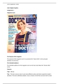
Composition – the graphics on the magazine cover is the main actor of the “Doctor Who”
series, the background of the image has effects to meet the theme of the series. The text on
the magazine are few different font styles, colours and sizes. They added these features to
highlight the main important information on the cover of the magazine. The magazine cover
photograph is just the main actor of the series in the middle, with some effects in the
background of the image to make it look more sci-fi. The text is aligned around the image of
the actress. The image of the actress is also covering some of the letters of the main heading
“Doctor Who”, which gives the reader an idea that the person who is displayed in front is
doctor who.
Use of colour and texture On the magazine cover there is some white text with red
background to highlight it and grab the reader’s attention. All the other colours on the
magazine cover are cold colours such as: dark blue, light blue, white, black. That text that
has cold colours shows less important information and its purpose isn’t to grab the attention
of the readers but just to make the headings standout. The bright colours in the background
image are yellow, orange
Size and position
The size and positioning is correct because the magazine cover displays the main actress on
the front to grab the fans attention an after they do grab the reader’s attention they can
further read all the highlighted important text around the image. The sizes of the text is
different, the most important information is written in a bigger font and less important text
is written in smaller font.
Characters and objects – The character in the magazine is the main actress of the “Doctor
Who” series.
Resolution –The image of the magazine is 96dpi, which means it was optimized to be
suitable for a website. If it was an image for a real magazine it would be bigger resolution
since it would be printed out.
Intended purpose
The intended purpose for this magazine is to advertise an interview of an actress from
“Doctor Who” series, to people who would be interested of watching that interview.
Intended impact to the audience
The intended impact to the audience of this magazine is to get them interested and excited
in watching the actual interview.
