Here is a suggested title: "Crafting Grid-Based Layouts: A Practical Guide to CSS Grid with Markup Examples and Source Code"
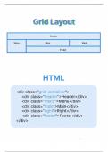
Key Points: display: grid;: Description: Initiates a grid container. Key Thing: The parent element becomes a grid container, and its direct children become grid items. grid-template-columns: repeat(3, 1fr);: Description: Defines the number and size of columns in the grid. Key Thing: In this example, it creates a grid with three columns of equal width. gap: 10px;: Description: Sets the gap (spacing) between grid items. Key Thing: Improves readability and separation between items. Grid Items (.item): Description: Each child element of the grid container becomes a grid item. Key Thing: Apply specific styling to grid items, such as background color, padding, and border-radius. Responsive Design: Media Queries: To make the grid layout responsive, you can use media queries to adjust the number of columns or change the layout for different screen sizes. Fr Unit: 1fr Unit: Represents a fraction of the available space. In this example, it's used to distribute the available space equally among the three columns.
Document information
- Uploaded on
- December 15, 2023
- Number of pages
- 3
- Written in
- 2023/2024
- Type
- Class notes
- Professor(s)
- Dr. david chen
- Contains
- All classes