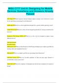
WGU C777 Unit 6: Designing for Mobile Devices Questions and Answers Already Passed
WGU C777 Unit 6: Designing for Mobile Devices Questions and Answers Already Passed fluid image Which responsive design technique adapts an image's size to the device's screen size by specifying a percentage for each dimension? mobile app What do we call an application designed for a specific mobile operating system? mobile Web site What do we call a web site designed specifically for viewing on mobile device browsers? Responsive Web Design (RWD) What do we call a web site designed to adapt to many different devices? Grid-based layouts Resizable images Media queries What are three Responsive Web Design techniques use to adjusts gracefully for desktop, tablet and smartphone browsers? fluid grid What is an adaptive grid that uses percentage-based dimensions? Grid-based layouts What uses invisible guidelines to help you place page elements to accommodate various screen sizes? frameworks What tools, templates or boilerplates provide the basic foundation for responsive design?
Document information
- Uploaded on
- December 11, 2023
- Number of pages
- 5
- Written in
- 2023/2024
- Type
- Exam (elaborations)
- Contains
- Questions & answers