WGU C784 APPLIED HEALTHCARE
STATISTICS MODULE 5 EXAM
QUESTIONS WITH COMPLETE
SOLUTIONS 2025/2026
When one variable causes change in another, we call the first variable the
___________________ variable*.
The affected variable is called the _______________ variable*. - ANSWERSWhen one
variable causes change in another, we call the first variable the explanatory variable*.
The affected variable is called the response variable*.
In a randomized experiment, the researcher manipulates values of the explanatory
variable and measures the resulting changes in the response variable. The different
values of the explanatory variable are called treatments. An experimental unit is a single
object or individual to be measured.
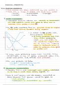
A two-way table, also known as a two-way frequency table or contingency table, is used
to show the relationship between two ______________________variables ( C→C ); the
rows show the categories of one variable, and the columns show the categories of the
other variable. - ANSWERScategorical variables ( C→C )
______________________. These represent the total number of instances that fall in
both the corresponding row and header.
The data in the green cells show _______________________________. These are
equal to the sum of the number of individuals in the corresponding row or column. -
ANSWERSThe cells in yellow show joint frequencies*. These represent the total
number of instances that fall in both the corresponding row and header.
For example, data in the "Male" row and "With Autism" column counts the number of
males with autism.
The data in the green cells show marginal frequencies*. These are equal to the sum of
the number of individuals in the corresponding row or column. For example, data in the
"Totals" column and "Female" row shows the total number of females in the study. It
may be helpful to remember that marginal frequencies appear in the margins of the
table.
, The bottom, right cell (in both the "Totals" column and the "Totals" row) measures the
total number of individuals in the study.
The relationship between two variables that are both quantitative can be displayed in a
__________________________. - ANSWERSscatterplot;
As we've seen earlier, every point on a coordinate plane can be represented by an
ordered pair*, ( x , y ). Here, the x -value is typically the _________________variable's
value for a piece of data, and the y -value is the corresponding value for the
________________________variable. A simple way to remember this fact is that the
term "explanatory" has an " x " in it. - ANSWERSexplanatory variable; response variable
Side-by-side box plots are a good choice for two-variable data where the explanatory
variable is ____________ data and the response variable is ____________ data. -
ANSWERSCategorical
Quantitative
Which variable, explanatory or response, is displayed on the x -axis on side-by-side
boxplots? - ANSWERSSide-by-side boxplots can be horizontal or vertical, so either
variable (explanatory or response) can be displayed on the x -axis.
A scatterplot is a good choice to display two-variable data that are both __________
variables. - ANSWERSQuantitative
The relationship between the x -variable and the y -variable is called _____________. -
ANSWERSCorrelation
What determines the location of a dot on a scatterplot? - ANSWERSA dot is placed on a
scatterplot according to its
x - and y -value.
When analyzing a possible relationship for two-variable data, if both variables are
categorical, what is the most appropriate choice to display the data?
a) Side-by-side boxplots
b) Scatterplot
c) Bar chart
d) Two-way frequency table
e) Histogram - ANSWERSAnswer: D
A two-way frequency table is the most appropriate way to graphically display a possible
relationship for two-variable data, when both variables are categorical.
A hospital hires an independent consulting firm to perform a study about patients with
high blood pressure, and the medicine they are being prescribed. The study is
STATISTICS MODULE 5 EXAM
QUESTIONS WITH COMPLETE
SOLUTIONS 2025/2026
When one variable causes change in another, we call the first variable the
___________________ variable*.
The affected variable is called the _______________ variable*. - ANSWERSWhen one
variable causes change in another, we call the first variable the explanatory variable*.
The affected variable is called the response variable*.
In a randomized experiment, the researcher manipulates values of the explanatory
variable and measures the resulting changes in the response variable. The different
values of the explanatory variable are called treatments. An experimental unit is a single
object or individual to be measured.
A two-way table, also known as a two-way frequency table or contingency table, is used
to show the relationship between two ______________________variables ( C→C ); the
rows show the categories of one variable, and the columns show the categories of the
other variable. - ANSWERScategorical variables ( C→C )
______________________. These represent the total number of instances that fall in
both the corresponding row and header.
The data in the green cells show _______________________________. These are
equal to the sum of the number of individuals in the corresponding row or column. -
ANSWERSThe cells in yellow show joint frequencies*. These represent the total
number of instances that fall in both the corresponding row and header.
For example, data in the "Male" row and "With Autism" column counts the number of
males with autism.
The data in the green cells show marginal frequencies*. These are equal to the sum of
the number of individuals in the corresponding row or column. For example, data in the
"Totals" column and "Female" row shows the total number of females in the study. It
may be helpful to remember that marginal frequencies appear in the margins of the
table.
, The bottom, right cell (in both the "Totals" column and the "Totals" row) measures the
total number of individuals in the study.
The relationship between two variables that are both quantitative can be displayed in a
__________________________. - ANSWERSscatterplot;
As we've seen earlier, every point on a coordinate plane can be represented by an
ordered pair*, ( x , y ). Here, the x -value is typically the _________________variable's
value for a piece of data, and the y -value is the corresponding value for the
________________________variable. A simple way to remember this fact is that the
term "explanatory" has an " x " in it. - ANSWERSexplanatory variable; response variable
Side-by-side box plots are a good choice for two-variable data where the explanatory
variable is ____________ data and the response variable is ____________ data. -
ANSWERSCategorical
Quantitative
Which variable, explanatory or response, is displayed on the x -axis on side-by-side
boxplots? - ANSWERSSide-by-side boxplots can be horizontal or vertical, so either
variable (explanatory or response) can be displayed on the x -axis.
A scatterplot is a good choice to display two-variable data that are both __________
variables. - ANSWERSQuantitative
The relationship between the x -variable and the y -variable is called _____________. -
ANSWERSCorrelation
What determines the location of a dot on a scatterplot? - ANSWERSA dot is placed on a
scatterplot according to its
x - and y -value.
When analyzing a possible relationship for two-variable data, if both variables are
categorical, what is the most appropriate choice to display the data?
a) Side-by-side boxplots
b) Scatterplot
c) Bar chart
d) Two-way frequency table
e) Histogram - ANSWERSAnswer: D
A two-way frequency table is the most appropriate way to graphically display a possible
relationship for two-variable data, when both variables are categorical.
A hospital hires an independent consulting firm to perform a study about patients with
high blood pressure, and the medicine they are being prescribed. The study is