Exam (elaborations)
Information_Visualization_Week5_NEC_Solved
Rating
Sold
-
Pages
9
Grade
A+
Uploaded on
24-08-2023
Written in
2023/2024
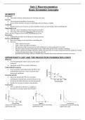
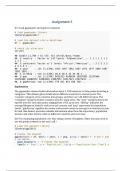
Experiment with the gapminder data to practice some of the new geoms we have learned. Try examining population or life expectancy over time using a series of boxplots. (Hint: you may need to use the group aesthetic in the aes() call.) Can you facet this boxplot by continent? Is anything different if you create a tibble from gapminder that explicitly groups the data by year and continent first, and then create your plots with that? Comment your code line by line. Explain what your charts are showing. Submit an R Markdown or submit screenshots with timestamps in a single Word file documenting your code and outcome .
Show more
Read less
Institution
Information Visualization
Course
Information Visualization
Whoops! We can’t load your doc right now. Try again or contact support.
Connected book
Written for
- Institution
- Information Visualization
- Course
- Information Visualization
Document information
- Uploaded on
- August 24, 2023
- Number of pages
- 9
- Written in
- 2023/2024
- Type
- Exam (elaborations)
- Contains
- Questions & answers
Subjects
-
informationvisualizationweek5necsolved
$10.49
Get access to the full document:
Wrong document? Swap it for free
Within 14 days of purchase and before downloading, you can choose a different document. You can simply spend the amount again.
Written by students who passed
Immediately available after payment
Read online or as PDF
Also available in package deal
Package deal
Information_Visualization_NEC_All_7_Weeks_Solved
8
2023
$ 83.92
More info