D2- Justify the information selected to support a
business decision-making process
In my first report I managed to find valuable information that Matlin Insurance might
be able to use. I used different methods to retrieve information from the excel
documents to produce valuable charts which were the highest selling cars for
2012/2013, worst selling cars, and total car sales for both years. Maltin can then
adjust their business targets to the data I have provided.
Highest Selling Car For 2013 and 2012
60,000 FordFord
Marque Registrations
55,000
50,000
45,000
40,000 Ford
35,000
30,000 FordFord Ford
FordFord
25,000 2013
20,000
15,000 2012
10,000
5,000
0
March April May June
Months
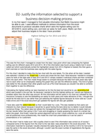
This was the first chart I managed to create from the data I was given which was comparing the highest
selling cars for different years 2012 and 2013. All of the information was found using a helpful tool in excel
called sort which automatically sorted the highlighted values from 2012 (Highest to lowest) this then gave a
brief overview on how the business was coping with the sales figures.
For this chart I decided to make this the bar chart with the axis labels. For this when all the data I needed
was selected I clicked on the Graph tool in excel and chose the bar chart. Now because I wanted to compare
years for both of the data sets of data 2012 and 2013 I simply created 2 individual charts and then combined
them into each other. This then made things easier to compare because the data from both years was right
next to each other so for employees viewing this graph they can see the difference easily. This kind of graph
was better for this situation than other graphs such as a Pie Chart because you wouldn’t be able to combine
them together to see the difference.
Calculating the highest selling car was important so for this the best tool would be to use ascending tool
which was located in the sort tab. So because I wanted to find the highest selling car I would use highest to
smallest rather than the other way around. All this information will be useful in my chart as it allowed for the
Insurance Company to see the bestselling car easily for both years and make decisions of this. I thought this
would be the best tool to use rather than just selecting the highest figures because its more valid as I could
make errors and if the excel document got updated the figures will also get updated.
I have also used the select data tool so that I could label my x axis. This was needed so that users can
interpret my chart clearer because it would be no good having the bars done but no labels it could indicate
numerous things. The select data tool allows the management team at Matlin Insurance to easily read out
the bar results rather than going in the Y-axis and struggling or maybe guessing the result of a certain bar
within the graph. And finally I sued the central alignment tool so that I could underline my x axis all centrally
and all positioned more professionally, this made the chart look presentable so it can be used in
presentations or for customers
For this chart I had to make sure I did a quality check to see if the information was correct so of course I
compared some of the figures from the chart to the raw data I was presented in the excel document. The
information matched for example I double checked the sales figures for all the months in 2012 for ford and it
was the same in the excel document, although I couldn’t see the exact number of registrations the figures
were the same.
business decision-making process
In my first report I managed to find valuable information that Matlin Insurance might
be able to use. I used different methods to retrieve information from the excel
documents to produce valuable charts which were the highest selling cars for
2012/2013, worst selling cars, and total car sales for both years. Maltin can then
adjust their business targets to the data I have provided.
Highest Selling Car For 2013 and 2012
60,000 FordFord
Marque Registrations
55,000
50,000
45,000
40,000 Ford
35,000
30,000 FordFord Ford
FordFord
25,000 2013
20,000
15,000 2012
10,000
5,000
0
March April May June
Months
This was the first chart I managed to create from the data I was given which was comparing the highest
selling cars for different years 2012 and 2013. All of the information was found using a helpful tool in excel
called sort which automatically sorted the highlighted values from 2012 (Highest to lowest) this then gave a
brief overview on how the business was coping with the sales figures.
For this chart I decided to make this the bar chart with the axis labels. For this when all the data I needed
was selected I clicked on the Graph tool in excel and chose the bar chart. Now because I wanted to compare
years for both of the data sets of data 2012 and 2013 I simply created 2 individual charts and then combined
them into each other. This then made things easier to compare because the data from both years was right
next to each other so for employees viewing this graph they can see the difference easily. This kind of graph
was better for this situation than other graphs such as a Pie Chart because you wouldn’t be able to combine
them together to see the difference.
Calculating the highest selling car was important so for this the best tool would be to use ascending tool
which was located in the sort tab. So because I wanted to find the highest selling car I would use highest to
smallest rather than the other way around. All this information will be useful in my chart as it allowed for the
Insurance Company to see the bestselling car easily for both years and make decisions of this. I thought this
would be the best tool to use rather than just selecting the highest figures because its more valid as I could
make errors and if the excel document got updated the figures will also get updated.
I have also used the select data tool so that I could label my x axis. This was needed so that users can
interpret my chart clearer because it would be no good having the bars done but no labels it could indicate
numerous things. The select data tool allows the management team at Matlin Insurance to easily read out
the bar results rather than going in the Y-axis and struggling or maybe guessing the result of a certain bar
within the graph. And finally I sued the central alignment tool so that I could underline my x axis all centrally
and all positioned more professionally, this made the chart look presentable so it can be used in
presentations or for customers
For this chart I had to make sure I did a quality check to see if the information was correct so of course I
compared some of the figures from the chart to the raw data I was presented in the excel document. The
information matched for example I double checked the sales figures for all the months in 2012 for ford and it
was the same in the excel document, although I couldn’t see the exact number of registrations the figures
were the same.