

Statistics
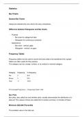
Bar Charts
Stacked Bar Charts
Values are stacked into one column for easy comparison.
Difference between Histograms and Bar Charts
Purpose
Bar chart for categorical data
Histogram for continuous numerical
Appearance
Bar chart - vertical, gaps
Histogram - vertical, no gaps
Frequency Tables
Frequency tables can be used to record and save data to be transferred into a graph.
Tallies are often useful for this purpose.
The category can be a range, number, or an ordinal or nominal category.
Category Frequency % Frequency
Rat 5 50%
Mouse 5 50%
Total 11 100%
P ercentageF requency = f requency/total ∗ 100
Box Plots
Box plots, also called box and whisker plots, visually demonstrate the distribution of a
data set. The values it shows are called the 5-number summary. It consists of these:
Minimum (Q0) (0th Percentile)
The smallest value in the data set.
, Lower Quartile (Q1) (25th Percentile)
The value in the data set which has 25% of the set under it, and 75% above it. The Q1
is in between the median and the minimum.
Q1P osition = 1/4(N oOf V alues + 1)
Inter-Quartile Range (IQR)
The IQR is the middle 50% of the data. It is found by subtracting the Q3 from the Q1.
It is a more reliable source of range as it is not as easily skewed by outliers. The IQR is
centred around the median, also known as Q2.
Median (Q2)
The median is the middle number in an ordered data set.
Q2P osition = 1/2(N oOf V alues + 1)
Upper Quartile (Q3) (75th Percentile)
The value in the data set which has 75% of the set under it, and 25% above it. The Q3
is in between the median and the max.
Q3P osition = 3/4(N oOf V alues + 1)
Maximum (Q4) (100th Percentile)
The largest value in the data set.
Example:
3, 5, 6, 8, 8, 8, 9, 10, 11, 11, 14
Minimum = 3
Q1 = 6
Q2 = 8
Q3 = 11
Maximum = 14
Range = 11
IQR = 5
Box and whisker plots, each of the four section between the 5 figures (called quartiles)
contain 25% of the data.
Bar Charts
Stacked Bar Charts
Values are stacked into one column for easy comparison.
Difference between Histograms and Bar Charts
Purpose
Bar chart for categorical data
Histogram for continuous numerical
Appearance
Bar chart - vertical, gaps
Histogram - vertical, no gaps
Frequency Tables
Frequency tables can be used to record and save data to be transferred into a graph.
Tallies are often useful for this purpose.
The category can be a range, number, or an ordinal or nominal category.
Category Frequency % Frequency
Rat 5 50%
Mouse 5 50%
Total 11 100%
P ercentageF requency = f requency/total ∗ 100
Box Plots
Box plots, also called box and whisker plots, visually demonstrate the distribution of a
data set. The values it shows are called the 5-number summary. It consists of these:
Minimum (Q0) (0th Percentile)
The smallest value in the data set.
, Lower Quartile (Q1) (25th Percentile)
The value in the data set which has 25% of the set under it, and 75% above it. The Q1
is in between the median and the minimum.
Q1P osition = 1/4(N oOf V alues + 1)
Inter-Quartile Range (IQR)
The IQR is the middle 50% of the data. It is found by subtracting the Q3 from the Q1.
It is a more reliable source of range as it is not as easily skewed by outliers. The IQR is
centred around the median, also known as Q2.
Median (Q2)
The median is the middle number in an ordered data set.
Q2P osition = 1/2(N oOf V alues + 1)
Upper Quartile (Q3) (75th Percentile)
The value in the data set which has 75% of the set under it, and 25% above it. The Q3
is in between the median and the max.
Q3P osition = 3/4(N oOf V alues + 1)
Maximum (Q4) (100th Percentile)
The largest value in the data set.
Example:
3, 5, 6, 8, 8, 8, 9, 10, 11, 11, 14
Minimum = 3
Q1 = 6
Q2 = 8
Q3 = 11
Maximum = 14
Range = 11
IQR = 5
Box and whisker plots, each of the four section between the 5 figures (called quartiles)
contain 25% of the data.


