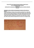
Scatterplots, Association, and Correlation Scatterplot – shows patterns, trends, relationships, and extraordinary values
○Observes two quantitative variables for a possible association between them
○When describing scatterplots and interpreting r, look for: -D – direction (eg. positive, negative, none)
-U – unusual observations (eg. outliers, gaps)
-F – form (eg. linear, curved)
-S – strength (eg. weak, moderate, strong) –1 –0.5 0 0.5 1
strong moderate weak moderate strong
Roles for Variables
○The variable of interest is the response variable (y-axis), and the predictor variable is
the explanatory variable (x-axis).
TI Tips – Creating a Scatterplot
Naming the Lists
1.Go into STAT Edit, place the cursor on one of the list names, and use the arrow key to
move right across all the lists until the blank column.
2.Type the x-variable name then hit ENTER. Then, type in the values in the column.
3.Go to the next blank column, name the y-variable, and enter the corresponding values.
Making the Scatterplot
1.Set up STAT PLOT and chose the first icon.
2.Identify which lists go into Xlist and Ylist. To specify them, go to 2nd LIST NAMES,
scroll down the list of variables, and hit ENTER on the right list.
3.Use ZoomStat to see the scatterplot. Use TRACE to see exact values.
Correlation Coefficient (r)
○A numerical measure of the direction and strength of a linear association
○It does not have units, nor does it change by switching axes.
○r is nonresistant, meaning outliers in a pattern strengthen correlation, and outliers out of a pattern weaken correlation.
Correlation Conditions
○Correlation measures the strength of the linear association between two quantitative variables. Before using it, check several conditions:
-Quantitative Variables Condition : Don’t make an error of calling an association involving a categorical variable a correlation. Correlation is for quantitative variables.
-Straight Enough Condition : Look at the scatterplot to see whether it looks reasonably straight, and check that the variables are truly linearly related. No linearity assumptions . -No Outliers Condition : Outliers can distort the correlation dramatically, making a weak association look strong and vice-versa, possibly even changing
the correlation’s sign. Check for outliers in the scatterplot.
TI Tips – Finding the Correlation
1.Under STAT CALC, select 8:LinReg(a+bx) and hit ENTER.
2.Specify Xlist and Ylist, but leave both FreqList: and StoreRegEQ: blank. Then, go to CALCULATE and hit ENTER.
Correlation Properties
○The sign of a correlation coefficient gives the direction of the association.
○Correlation is always between –1 and 1 . It can be exactly equal to –1.0 or +1.0, but that is unusual in real data.
○Correlation treats variables symmetrically . The correlation of x with y is the same as that of y with x.
○A correlation has no units.
○Correlation is not affected by changes in the center, scale, units, or baseline of either variable. A correlation only depends on the z-scores .
○Correlation measures the strength of the linear association between two variables. Variables can be strongly associated but still have a small correlation if the association is nonlinear.
○Correlation is sensitive to outliers .
Correlation ≠ Causation
○Just because two variables correlate does not mean that one causes the other.
Straightening Scatterplots
TI Tips – Straightening a Curve
1.Enter the data into two lists.
2.Set up a STAT PLOT to create a scatterplot with the corresponding Xlist: and Ylist:
3.Create the command to square all the values in the list with y-values and STOre those results in the next blank list. Hit ENTER.
4.Go back to STAT PLOT and change the setup. Xlist: stays the same, but specify Ylist: as the newly created list.
5.ZoomStat again.