A p p e n d i x GRAPHS IN
ECONOMICS
Key Concepts
Graphing Data
Graphs represent quantity as a distance on a line. On a
graph, the horizontal scale line is the x-axis, the vertical
scale line is the y-axis, and the intersection of the two
scale lines is the origin.
The three main types of economic graphs are:
♦ Time-series graphs demonstrate the relationship
between time, measured on the x-axis, and other
variable(s), measured on the y-axis. Time-series
graphs show the variable’s level, direction of change,
speed of change, and trend, which is its general
tendency to rise or fall.
♦ Cross-section graphs show the values of a variable
for different groups in a population at a point in
time.
♦ Scatter diagrams plot the value of one variable
against the value of another to show the relationship
between two variables. Such a relationship indicates
how the variables are correlated, not whether one
variable causes the other.
Graphs Used in Economic Models
The four important relationships between variables are:
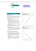
♦ Positive relationship or direct relationship — the
variables move together in the same direction, as il-
lustrated in Figure A1.1. The relationship is up-
ward-sloping.
♦ Negative relationship or inverse relationship —
the variables move in opposite directions, as shown
in Figure A1.2. The relationship is downward-
sloping.
11
, 12 CHAPTER 1
♦ Maximum or minimum — the relationship reaches
a maximum or a minimum point, then changes di-
rection. Figure A1.3 shows a minimum.
♦ Unrelated — the variables are not related so that,
when one variable changes, the other is unaffected.
The graph is either a vertical or horizontal straight
line, as illustrated in Figure A1.4.
A relationship illustrated by a straight line is called a
linear relationship.
The Slope of a Relationship
The slope of a relationship is the change in the value of
the variable on the y-axis divided by the change in the
value of the variable on the x-axis. The formula for
slope is ∆y/∆x, with ∆ meaning “change in.”
A straight line (or linear relationship) has a constant
slope. A curved line has a varying slope, which can be
calculated two ways:
♦ Slope at a point — by drawing the straight line tan-
gent to the curve at that point and then calculating
the slope of the line.
♦ Slope across an arc — by drawing a straight line
across the two points on the curve and then calcu-
lating the slope of the line.
Graphing Relationships Among More Than
Two Variables
Relationships between more than two variables can be
graphed by holding constant the values of all the vari-
ables except two (the ceteris paribus assumption, that is,
“other things remaining the same”) and then graphing
the relationship between the two with, ceteris paribus,
only the variables being studied changing. When one of
the variables not illustrated in the figure changes, the
entire relationship between the two that have been
graphed shifts. Economists do so because graphs simplify the analy-
sis. All the key concepts you need to master are pre-
sented in this appendix. If your experience with
Helpful Hints graphical analysis is limited, this appendix is crucial
to your ability to readily understand economic
analysis. However, if you are experienced in con-
1. IMPORTANCE OF GRAPHS AND GRAPHICAL
structing and using graphs, this appendix may be
ANALYSIS : Economists almost always use graphs to
“old hat.” Even so, you should skim the appendix
present relationships between variables. This fact
and work through the questions in this Study
should not “scare” you nor give you pause.
Guide.
ECONOMICS
Key Concepts
Graphing Data
Graphs represent quantity as a distance on a line. On a
graph, the horizontal scale line is the x-axis, the vertical
scale line is the y-axis, and the intersection of the two
scale lines is the origin.
The three main types of economic graphs are:
♦ Time-series graphs demonstrate the relationship
between time, measured on the x-axis, and other
variable(s), measured on the y-axis. Time-series
graphs show the variable’s level, direction of change,
speed of change, and trend, which is its general
tendency to rise or fall.
♦ Cross-section graphs show the values of a variable
for different groups in a population at a point in
time.
♦ Scatter diagrams plot the value of one variable
against the value of another to show the relationship
between two variables. Such a relationship indicates
how the variables are correlated, not whether one
variable causes the other.
Graphs Used in Economic Models
The four important relationships between variables are:
♦ Positive relationship or direct relationship — the
variables move together in the same direction, as il-
lustrated in Figure A1.1. The relationship is up-
ward-sloping.
♦ Negative relationship or inverse relationship —
the variables move in opposite directions, as shown
in Figure A1.2. The relationship is downward-
sloping.
11
, 12 CHAPTER 1
♦ Maximum or minimum — the relationship reaches
a maximum or a minimum point, then changes di-
rection. Figure A1.3 shows a minimum.
♦ Unrelated — the variables are not related so that,
when one variable changes, the other is unaffected.
The graph is either a vertical or horizontal straight
line, as illustrated in Figure A1.4.
A relationship illustrated by a straight line is called a
linear relationship.
The Slope of a Relationship
The slope of a relationship is the change in the value of
the variable on the y-axis divided by the change in the
value of the variable on the x-axis. The formula for
slope is ∆y/∆x, with ∆ meaning “change in.”
A straight line (or linear relationship) has a constant
slope. A curved line has a varying slope, which can be
calculated two ways:
♦ Slope at a point — by drawing the straight line tan-
gent to the curve at that point and then calculating
the slope of the line.
♦ Slope across an arc — by drawing a straight line
across the two points on the curve and then calcu-
lating the slope of the line.
Graphing Relationships Among More Than
Two Variables
Relationships between more than two variables can be
graphed by holding constant the values of all the vari-
ables except two (the ceteris paribus assumption, that is,
“other things remaining the same”) and then graphing
the relationship between the two with, ceteris paribus,
only the variables being studied changing. When one of
the variables not illustrated in the figure changes, the
entire relationship between the two that have been
graphed shifts. Economists do so because graphs simplify the analy-
sis. All the key concepts you need to master are pre-
sented in this appendix. If your experience with
Helpful Hints graphical analysis is limited, this appendix is crucial
to your ability to readily understand economic
analysis. However, if you are experienced in con-
1. IMPORTANCE OF GRAPHS AND GRAPHICAL
structing and using graphs, this appendix may be
ANALYSIS : Economists almost always use graphs to
“old hat.” Even so, you should skim the appendix
present relationships between variables. This fact
and work through the questions in this Study
should not “scare” you nor give you pause.
Guide.