Bekijk alle 11 samenvattingen van Data Visualization, geschreven door Kieran Healy. De samenvattingen van Data Visualization op Stuvia zijn geschreven door studenten of docenten, waardoor je de inhoud van het studieboek makkelijker en sneller begrijpt. Door de samenvatting te vinden die perfect bij jouw leerstijl past, wordt studeren een stuk eenvoudiger.
Auteur(s)
Kieran Healy
ISBN
9780691181622
Uitgever
Princeton University Press
Taal
en
Alle
11 resultaten
Sorteer op:
Meest verkochte samenvattingen voor Data Visualization
In groups of up to three create a map to show the regions that a sales rep is responsible for. This will be for Canada or US. Please make sure each rep’s zone is distinct from each other. All states and territories should be labeled with its abbreviation. Every state should have one rep, Kentucky has two. The map should have a title and legend. This map should look professional in appearance and easy to understand.
Use the file attached to zone on your map.
Create your own Gapminder animated gapminder plot using the attached tutorial.
Submit an R Markdown file with all your code and your visualization. Comment your code line by line explaining what each function and each function parameter is for.
Information_Visualization_Week7_NEC_Solved
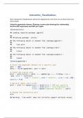
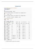
Experiment with the gapminder data to practice some of the new geoms we have learned. Try examining population or life expectancy over time using a series of boxplots. (Hint: you may need to use the group aesthetic in the aes() call.) Can you facet this boxplot by continent? Is anything different if you create a tibble from gapminder that explicitly groups the data by year and continent first, and then create your plots with that? Comment your code line by line. Explain what your charts are show...
Participate in Andy Kriebel’s Makeover Monday Project (
Andy Kriebel’s makeover Monday dataset is published every Sunday. Use any Sunday dataset and create a makeover of the chart using the provided data. Explain the difference in your plot. Comment your code line by line and explain what the charts are showing. Submit an R Markdown.
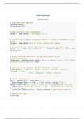
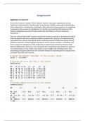
Create a scatter plot of gdp v life expectancy for five countries over a period of years. Show each country in a different color. Add a trend line. Comment your code line by line. Explain in a paragraph of at least five sentences what the chart is showing. Submit an R Markdown file with interpretations of each chart. Do not copy. Your work should be your own Your writing should be in your own words.
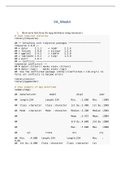
Create Anscombe's quartet of visualizations. Comment your code line by line. Explain the significance of the Quartet. Why do we include it in our studies? Submit an R Markdown file that includes an interpretation of every visualization you provide.
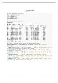
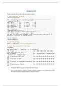
Show meta data from the mpg dataframe using summary().
Show metadata from the gapminder dataframe
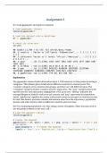
assign ggplot(data = gapminder, mapping = aes(x = gdpPercap, y = lifeExp) to the variable 'p'
find the structure of the p object.
add () to the p object. Show p.
replace () with h(). Show p.
return to and add h(). Show p.
add the linear element to the h function. Show p.
change the x axis scare to log10. Show p.
try scale_y_log10(). Show p.
change the method to gam from lm. Show p.
re...
Install R and R studio and all the packages Healy requires. Add the package 'socviz' to the list provided and you can skip installing from githum. Explore R Studio. Highlight the different windows and tabs. Take screenshots of your work. Submit a Word document with those screenshots in it and explain each one.
In groups of up to three create a map to show the regions that a sales rep is responsible for. This will be for Canada or US. Please make sure each rep’s zone is distinct from each other. All states and territories should be labeled with its abbreviation. Every state should have one rep, Kentucky has two. The map should have a title and legend. This map should look professional in appearance and easy to understand.
Use the file attached to zone on your map.
Experiment with the gapminder data to practice some of the new geoms we have learned. Try examining population or life expectancy over time using a series of boxplots. (Hint: you may need to use the group aesthetic in the aes() call.) Can you facet this boxplot by continent? Is anything different if you create a tibble from gapminder that explicitly groups the data by year and continent first, and then create your plots with that? Comment your code line by line. Explain what your charts are show...
Create a scatter plot of gdp v life expectancy for five countries over a period of years. Show each country in a different color. Add a trend line. Comment your code line by line. Explain in a paragraph of at least five sentences what the chart is showing. Submit an R Markdown file with interpretations of each chart. Do not copy. Your work should be your own Your writing should be in your own words.
Participate in Andy Kriebel’s Makeover Monday Project (
Andy Kriebel’s makeover Monday dataset is published every Sunday. Use any Sunday dataset and create a makeover of the chart using the provided data. Explain the difference in your plot. Comment your code line by line and explain what the charts are showing. Submit an R Markdown.
Create Anscombe's quartet of visualizations. Comment your code line by line. Explain the significance of the Quartet. Why do we include it in our studies? Submit an R Markdown file that includes an interpretation of every visualization you provide.
Create your own Gapminder animated gapminder plot using the attached tutorial.
Submit an R Markdown file with all your code and your visualization. Comment your code line by line explaining what each function and each function parameter is for.
Information_Visualization_Week7_NEC_Solved
Install R and R studio and all the packages Healy requires. Add the package 'socviz' to the list provided and you can skip installing from githum. Explore R Studio. Highlight the different windows and tabs. Take screenshots of your work. Submit a Word document with those screenshots in it and explain each one.
Show meta data from the mpg dataframe using summary().
Show metadata from the gapminder dataframe
assign ggplot(data = gapminder, mapping = aes(x = gdpPercap, y = lifeExp) to the variable 'p'
find the structure of the p object.
add () to the p object. Show p.
replace () with h(). Show p.
return to and add h(). Show p.
add the linear element to the h function. Show p.
change the x axis scare to log10. Show p.
try scale_y_log10(). Show p.
change the method to gam from lm. Show p.
re...