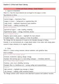
Question 5: Critical and Visual Literacy
Critical and Visual Literacy - Visual Analysis
a. Layout & Composition
What it is: How the visual elements are arranged on the page or screen.
Key elements to notice:
Placement & Size
Central images → importance, focus.
Images in corners → background or supplementary info.
Large visuals → emphasize importance, grab attention.
Small visuals → subtlety, secondary info.
Balance & Symmetry
Symmetrical layout → order, stability, reliability.
Asymmetrical layout → energy, movement, tension.
Focus & Negative Space
Negative space (empty space) → highlights the main element.
Crowded layouts → chaos, urgency, or stress the problem.
Tip: Always link the placement of visuals to the intended message or feeling.
Example: In an environmental ad, a single plastic bottle in the centre with empty space
around it draws attention to its negative impact.
b. Colour
What it is: Colours convey emotions, attract attention, and symbolize ideas.
How to analyse:
Warm Colours (red, orange, yellow)
Emotions: excitement, urgency, danger, energy.
Example: Red warning sign in a road safety campaign → immediate attention.
Cool Colours (blue, green, purple)
Emotions: calm, trust, reliability, harmony.
Example: Blue in a healthcare ad → conveys safety and trustworthiness.
Contrast
High contrast → highlights key message or slogan.
Low contrast → subtlety, softer emotional impact.
Tip: Always connect colour choices to the advertiser’s purpose and audience reaction.