WGU C784-Statistics Mod 5 questions with verified
answers
______________________. These represent the total number of instances that
fall in both the corresponding row and header.
The data in the green cells show _______________________________. These are
equal to the sum of the number of individuals in the corresponding row or
column. Ans✓✓✓ The cells in yellow show joint frequencies*. These represent
the total number of instances that fall in both the corresponding row and header.
For example, data in the "Male" row and "With Autism" column counts the
number of males with autism.
The data in the green cells show marginal frequencies*. These are equal to the
sum of the number of individuals in the corresponding row or column. For
example, data in the "Totals" column and "Female" row shows the total number
of females in the study. It may be helpful to remember that marginal frequencies
appear in the margins of the table.
The bottom, right cell (in both the "Totals" column and the "Totals" row)
measures the total number of individuals in the study.
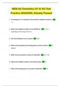
1. A hospital is studying the effectiveness of two different heartburn treatments
(Treatment A and Treatment B) administered daily for a week. The results are
measured after one week of treatment, by placing a patient into one of two
groups: heartburn subsided OR heartburn remained. Which numerical measure
could be used to analyze the data?
,a. Correlation coefficient
b. Five-number summary
c. Median
d. Conditional percentages Ans✓✓✓ Correct. The answer is d. Both variables are
categorical (C→C) so we will use a two-way table. Therefore, our numerical
measure will be conditional percentages.
1) Strong Positive Linear Correlation ( Lower left corner to upper right corner)
2) Strong Negative Linear Correlation ( Upper left corner to lower right corner)
Ans✓✓✓
13. When working with two-variable data, if both variables are quantitative, what
is the most appropriate choice to display the data?
a) Side-by-side boxplots
b) Scatterplot
c) Bar chart
d) Two-way frequency table
e) Histogram Ans✓✓✓ Answer: B
When working with two-variable data, if both variables are quantitative, a
scatterplot is the most appropriate choice to display the data.
, 3) Very weak, correlation
4) nonlinear or curvilinear association Ans✓✓✓
4. Consider a study on whether a certain medication improves kidney function in
patients with chronic kidney disease. The Glomerular Filtration Rate (GFR) was
collected for two groups: a treatment group and a placebo group. The researchers
want to compare the middle 50% of the data for both groups. Which numerical
measure would identify the two values that 50% of the data falls between for
both groups?
a. Median
b. Five-number summary
c. Mode
d. Joint Frequencies Ans✓✓✓ 4. Consider a study on whether a certain
medication improves kidney function in patients with chronic kidney disease. The
Glomerular Filtration Rate (GFR) was collected for two groups: a treatment group
and a placebo group. The researchers want to compare the middle 50% of the
data for both groups. Which numerical measure would identify the two values
that 50% of the data falls between for both groups?
b. Five-number summary
answers
______________________. These represent the total number of instances that
fall in both the corresponding row and header.
The data in the green cells show _______________________________. These are
equal to the sum of the number of individuals in the corresponding row or
column. Ans✓✓✓ The cells in yellow show joint frequencies*. These represent
the total number of instances that fall in both the corresponding row and header.
For example, data in the "Male" row and "With Autism" column counts the
number of males with autism.
The data in the green cells show marginal frequencies*. These are equal to the
sum of the number of individuals in the corresponding row or column. For
example, data in the "Totals" column and "Female" row shows the total number
of females in the study. It may be helpful to remember that marginal frequencies
appear in the margins of the table.
The bottom, right cell (in both the "Totals" column and the "Totals" row)
measures the total number of individuals in the study.
1. A hospital is studying the effectiveness of two different heartburn treatments
(Treatment A and Treatment B) administered daily for a week. The results are
measured after one week of treatment, by placing a patient into one of two
groups: heartburn subsided OR heartburn remained. Which numerical measure
could be used to analyze the data?
,a. Correlation coefficient
b. Five-number summary
c. Median
d. Conditional percentages Ans✓✓✓ Correct. The answer is d. Both variables are
categorical (C→C) so we will use a two-way table. Therefore, our numerical
measure will be conditional percentages.
1) Strong Positive Linear Correlation ( Lower left corner to upper right corner)
2) Strong Negative Linear Correlation ( Upper left corner to lower right corner)
Ans✓✓✓
13. When working with two-variable data, if both variables are quantitative, what
is the most appropriate choice to display the data?
a) Side-by-side boxplots
b) Scatterplot
c) Bar chart
d) Two-way frequency table
e) Histogram Ans✓✓✓ Answer: B
When working with two-variable data, if both variables are quantitative, a
scatterplot is the most appropriate choice to display the data.
, 3) Very weak, correlation
4) nonlinear or curvilinear association Ans✓✓✓
4. Consider a study on whether a certain medication improves kidney function in
patients with chronic kidney disease. The Glomerular Filtration Rate (GFR) was
collected for two groups: a treatment group and a placebo group. The researchers
want to compare the middle 50% of the data for both groups. Which numerical
measure would identify the two values that 50% of the data falls between for
both groups?
a. Median
b. Five-number summary
c. Mode
d. Joint Frequencies Ans✓✓✓ 4. Consider a study on whether a certain
medication improves kidney function in patients with chronic kidney disease. The
Glomerular Filtration Rate (GFR) was collected for two groups: a treatment group
and a placebo group. The researchers want to compare the middle 50% of the
data for both groups. Which numerical measure would identify the two values
that 50% of the data falls between for both groups?
b. Five-number summary