1. What is Tailwind CSS?
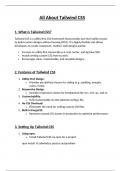
Tailwind CSS is a utility-first CSS framework that provides low-level utility classes
to build custom designs without leaving HTML. It is highly flexible and allows
developers to create responsive, modern web designs quickly.
Focuses on utility-first classes like p-4, text-center, and bg-blue-500.
Avoids writing custom CSS from scratch.
Encourages clean, maintainable, and reusable designs.
2. Features of Tailwind CSS
1. Utility-First Design:
o Provides pre-defined classes for styling (e.g., padding, margins,
colors, fonts).
2. Responsive Design:
o Includes responsive classes for breakpoints like sm:, md:, lg:, and xl:.
3. Customizability:
o Fully customizable via the tailwind.config.js file.
4. No CSS Overhead:
o Eliminates the need for writing custom CSS files.
5. Built-in PurgeCSS:
o Removes unused CSS classes in production to optimize performance.
3. Setting Up Tailwind CSS
1. Using npm:
o Install Tailwind CSS via npm for a project.
npm install -D tailwindcss postcss autoprefixer
, npx tailwindcss init
2. Add Tailwind to CSS File:
o Configure the tailwind.config.js file and include Tailwind in your CSS.
@tailwind base;
@tailwind components;
@tailwind utilities;
3. Compile Tailwind:
o Use a build tool like PostCSS to compile the CSS.
npx tailwindcss build src/styles.css -o dist/styles.css
4. CDN Method:
o Add Tailwind directly to a project via a CDN for simple setups.
<link
href="https://cdn.jsdelivr.net/npm/tailwindcss@2.2.19/dist/tailwind.min.c
ss" rel="stylesheet">
4. Core Concepts of Tailwind CSS
1. Utility Classes:
o Use predefined utility classes directly in HTML for styling.
<div class="p-4 bg-blue-500 text-white">Hello, Tailwind!</div>
2. Responsive Design:
o Apply different styles based on screen size.
<div class="text-sm md:text-lg lg:text-xl">Responsive Text</div>
3. Hover and Focus States:
o Use pseudo-class utilities for interactive styles.
<button class="bg-blue-500 hover:bg-blue-700 text-white font-bold py-2
px-4 rounded">

