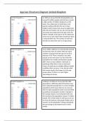
Age/sex Structure Diagram United Kingdom
In 1950 we can see that the UK population was
around 50 million people and that there is quite
a high number of children being born at this
point. This is likely due to World War 2 and
parents waiting until after the war to have
children which means that you get a baby boom
after the war finishes. We can also see that there
are barely any people above the age of 90. The
indent of people at the age of 10-19 is likely due
to the war as well, where them would have been
a reduced birth rate. The number of male and
females are about the same at all age groups.
From 1950 to 2000 we can see that UKs pyramid
has become more of a tower with very equal
numbers of people from the age of 0 to 60 at
between 3-4%. There is however, less older
people as they were born in a time when the
population was smaller and therefore people
didn’t have as many children. Obviously as
people get older there is also an increased
chance of death due to multiple different health
conditions that can occur. It can also be noted
that women tend to live longer as in the age
groups above 70 there is a much higher
percentage of women.
Looking in to 2050 we can see that the older
generation in 2000 have died off and have now
been replaced by people born in a time of higher
population which means that we can now see
that the older population bands have been filled
up without increasing the number of people in
the younger bands or increasing the birth rate,
this had led to the population rising to 74 million
people. This is likely where it will stop as we can
see from the bottom of the graph fertility rate is
around 2 as the population is being maintained,
the percentage at the bottom levels is fairly
similar.