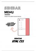
Here is a suggested title for a sidebar menu website frontend project with HTML, CSS, and source code: "Sleek Sidebar: Responsive Navigation Menu with HTML, CSS, JavaScript Source Code"
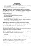
Key Points: Container Flex Layout: The main container uses display: flex to create a flexbox layout. The container holds the sidebar and the main content. Sidebar Styling: The sidebar has a fixed width (width: 250px) and a background color of #333. Links inside the sidebar are styled with text-decoration: none and white color. Main Content Styling: The main content area (class="content") has a flexible width (flex-grow: 1) to fill the remaining space in the container. It has a background color of #f1f1f1. Responsive Design: The design is responsive, and the sidebar collapses gracefully on smaller screens. You can add media queries to adjust styles for different screen sizes. HTML Links: Replace # in the anchor (a) tags with the actual URLs for each page.
Written for
- Course
- COMPUTER
Document information
- Uploaded on
- December 15, 2023
- Number of pages
- 5
- Written in
- 2023/2024
- Type
- Class notes
- Professor(s)
- Dr. felipe torres dr. aisha abdelaziz
- Contains
- All classes
Subjects
-
html sidebar menu
-
sidebar m
-
creating menu bar in html and css css
-
build a website with html and css
-
navigation bar using html and css navbar html css
-
responsive navbar in html css sidebar menu in html
Also available in package deal