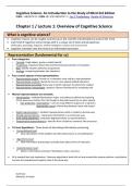
Chapter 4 Designing Webpages with CSS
When learning how to design webpages with CSS (Cascading Style Sheets), encountered
several challenges. Here are some common areas that I found hard to understand:
1. Box model: The CSS box model defines how elements are rendered on a webpage, including
the content, padding, borders, and margins. Understanding how these components interact and
affect the overall layout can be challenging for beginners. Since I am a beginner I had to use
different resourses like https://www.w3schools.com/css/css_boxmodel.asp. I found out that
Content - The content of the box, where text and images appear
Padding - Clears an area around the content. The padding is transparent
Border - A border that goes around the padding and content
Margin - Clears an area outside the border. The margin is transparent
The box model allows us to add a border around elements, and to define space between
elements.
2. Selectors and specificity: CSS selectors determine which elements on a webpage the styles
should be applied to. I struggled with understanding the different types of selectors and their
specificity rules. I found it difficult to grasp concepts like class selectors, ID selectors,
descendant selectors, and how they override or cascade styles.
3. Positioning and layout: Properly positioning elements and creating desired layouts using CSS
can be tricky. Concepts like floats, positioning properties (e.g., relative, absolute, fixed), and
flexbox/grid layouts was confusing for me. Understanding how these properties work together
and affect the flow and behavior of elements required practice and experimentation. I got it
eventually
4. Responsive design: Designing webpages that adapt well to different screen sizes and
devices is crucial. I found it challenging to understand the principles and techniques of
responsive design, such as using media queries and viewport settings to create responsive
layouts.
To overcome these challenges, I mostly benefited from hands-on practice, experimenting with
different CSS properties and techniques, seeking help from online resources like
https://www.w3schools.com/, and https://www.freecodecamp.org/learn/2022/responsive-web-
design/. To other students participating in coding communities or forums can provide
opportunities for discussions and guidance from experienced developers.