Unit 6 assignment 2
Displaying and interpreting data
Task 1
1.1
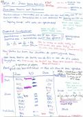
Both primary and secondary (Jared Green) graphs have been drawn.
1.2
From both graphs, it can be interpreted that the graph has the main aim of determining
the protein concentration in a urine sample. The data plotted shows how the
absorbance increases when the concentration of protein increases and this data can be
used to determine the concentration of a urine sample with aid of a line of best fit. The
appropriate scale on both graphs are the same, making the trends clear to see. If the
scale is inappropriate, the graph would look like this:
For primary and secondary data, the graph represents a directly proportional
relationship. This is shown as when the concentration of protein increases, the
absorbance increases and it is a straight line through zero. It is clear that there are
errors involved in this data as not all points are on the straight line and therefore the line
of best fit does not go through every point of data. These errors would commonly be a
pipetting error. For example, if a 10ml pipette was used to measure 2ml of a solution,
the percentage error would be bigger and more likely. Other errors (random or
systematic) could include the pencil line being too thick ; inaccurate readings from
colorimeter; cross contamination by not using different pipettes for each substance;
labelling test tubes wrong providing mixed up data; test tubes not sterilised and so
contaminating data: not calibrating the colorimeter to zero; not writing the data down
, Unit 6 assignment 2
personally (by asking a friend to note it down the data may be misheard and altered);
using the wrong wavelength filter or another pipetting error due to the human eye.
Although there are no obvious anomalies, the data still shows that results are not 100%
accurate. If there was no errors, the graphs points would meet up to form a straight line
like this:
Linear functions make graphs that are perfectly straight lines. Nonlinear functions have
graphs that are curved. Linear graphs have no exponents higher than 1. Whereas
nonlinear graphs have at least one exponent higher than 1. Therefore the primary and
secondary graphs are linear.
Displaying and interpreting data
Task 1
1.1
Both primary and secondary (Jared Green) graphs have been drawn.
1.2
From both graphs, it can be interpreted that the graph has the main aim of determining
the protein concentration in a urine sample. The data plotted shows how the
absorbance increases when the concentration of protein increases and this data can be
used to determine the concentration of a urine sample with aid of a line of best fit. The
appropriate scale on both graphs are the same, making the trends clear to see. If the
scale is inappropriate, the graph would look like this:
For primary and secondary data, the graph represents a directly proportional
relationship. This is shown as when the concentration of protein increases, the
absorbance increases and it is a straight line through zero. It is clear that there are
errors involved in this data as not all points are on the straight line and therefore the line
of best fit does not go through every point of data. These errors would commonly be a
pipetting error. For example, if a 10ml pipette was used to measure 2ml of a solution,
the percentage error would be bigger and more likely. Other errors (random or
systematic) could include the pencil line being too thick ; inaccurate readings from
colorimeter; cross contamination by not using different pipettes for each substance;
labelling test tubes wrong providing mixed up data; test tubes not sterilised and so
contaminating data: not calibrating the colorimeter to zero; not writing the data down
, Unit 6 assignment 2
personally (by asking a friend to note it down the data may be misheard and altered);
using the wrong wavelength filter or another pipetting error due to the human eye.
Although there are no obvious anomalies, the data still shows that results are not 100%
accurate. If there was no errors, the graphs points would meet up to form a straight line
like this:
Linear functions make graphs that are perfectly straight lines. Nonlinear functions have
graphs that are curved. Linear graphs have no exponents higher than 1. Whereas
nonlinear graphs have at least one exponent higher than 1. Therefore the primary and
secondary graphs are linear.