Topic 1 – Graphical descriptive statistics
Why don’t researchers use common sense?
• Biases in human decision making
Is a common-sense approach always trustworthy?
• Common sense may yield basic conclusions
• Belief bias: is the tendency to be influenced by one’s knowledge about the world in evaluating
conclusions and to accept them as true because they are believable rather than because they are
logically valid
• Other biases: Confirmation bias, survivorship bias, Hawthorne effect (or Observer Effect),
publication bias etc
- Confirmation bias: you believe something, and you want to come to a conclusion that is in
favour or your own belief, so you don’t properly look at the evidence
- Survivorship bias: if you only look at successful people, then that won’t allow you to
understand why they are successful, you also need to look at what leads to failure
- Hawthorne/observer effect: If you are being observed, the answers that you give wont always
be truthful (especially when it is sensitive topic)
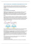
Simpson’s paradox
• Data can be misleading
• It seems as though female applications
have a better success rate when looking
at each subject, but when you look at the
aggregate success rate, males have a
higher success rate
• Simpson’s paradox: A phenomenon that can occur when data from two or more studies are
merged, giving results that differ from those of either study individually
• We need to know that the success rate of female applicants are higher in both departments, and
that the number are different
• An unobserved preference may explain why more women apply to the history department than
economics
Decision making in an uncertain environment
• Everyday decisions are based on incomplete information
• Examples:
- Do higher qualifications improve your employment chances?
- Will a one-off wealth tax be effective in raising money?
• Gathering, presenting, and summarising data can be illuminating
From a statistical standpoint, data is least important, then information, then knowledge is the most
important
,Population versus sample
• Population: is the collection of all items of interest or under investigation (N)
• Sample: is an observed subset of the population (n)
• Parameter: is a specific characteristic of a population e.g. only looking at the average income of a
population – no always possible to get something representing the whole population
• Statistic: is a specific characteristic of a sample e.g. if not all information is available, you only have
the information on a subset of the people, so you calculate and average
Descriptive and Inferential Statistics
• Two branches of statistics:
- Descriptive statistics: Summarises the main features of a dataset (e.g. measures such as mean
and s.d.) – such as looking at the average income
- Inferential Statistics: Generalizes from the observed data (sample) to the world at large
(population). e.g. estimation, hypothesis testing
• Descriptive statistics:
- Graphical analysis: Visualising data
- Numerical analysis: Estimating summary measures
Descriptive Statistics
• Descriptive statistical method aims to present information in a clear, concise, and accurate manner
• Many ways of summarising data (graphical): Plotting bar charts, pie charts etc.
• Successful techniques:
- tell us something useful about the underlying data
- are reasonably familiar to many people
• The appropriate method of analysing data depends on:
- the type of data you have (e.g. categorical, numerical)
- the audience (e.g. academic, manager)
- the message which is intended to convey
Classifications of variables
For categorical data, there
is only a set number of
answers e.g. yes or no
Continuous data can be in
fractions, unlike discrete
,Measurement levels
• you can rank ordinal data in
some form of order e.g.
grades from good to bad;
you can’t order nominal
data
• Interval data you can measure
temperature using a
thermometer, but can change
between celcius and
farenheight so there is no
actual 0 (0 for one isn’t 0 for
the other) (e.g ruler)
• Ratio data: e.g. income or
wealth, true 0 exists
Categorical data
Relationship between Employment and Education
• Questions of interest:
- Are more highly educated people more likely to be employed?
- Do you need a degree or just A-levels (school leaving certificate)?
- How much more likely to be unemployed are you if you have no qualification?
• Data:
- Data on employment status and educational attainment for a sample of 37789 individuals in the
UK in 2009
• That is a lot of data!
• How do we find any pattern in the data?
• Starting point: Cross tabulate data
Cross tables
• Cross Tables (or
contingency tables) list the
number of observations for
every combination of
values for two categorical
or ordinal variables.
Observations:
• About 72% in work (27330/37789)
• Largest group of employed have ‘Other qualifications’
• Let’s focus on the ‘In work’ category
, Bar Chart of the ‘In work’ Category
• Some patterns emerge:
- Roughly equal number with higher education
and other qualifications
- Not many unemployed amongst this group
- But, what about those unemployed or
inactive? How do they compare to this group?
Multiple Bar Chart
• Observations:
- Those with no qualifications have relatively
many inactive persons
- This is still a little hard to interpret.
Stacked Bar Chart – Percentage
• Observations:
- The pattern is clear once we calculate the
percentage figures
- Around 85% of the highly educated are
employed, but only about 40% of those with
no qualifications
- Unemployment varies with qualifications
Those with a degree are less likely to be unemployed
Pie Chart
• A pie chart is a good way to describe how a variable
is distributed between different categories.
• If you are drawing pie chart by hand, the angle of
each slice can be calculated as:
Angle = (frequency/total frequency) × 360
Why don’t researchers use common sense?
• Biases in human decision making
Is a common-sense approach always trustworthy?
• Common sense may yield basic conclusions
• Belief bias: is the tendency to be influenced by one’s knowledge about the world in evaluating
conclusions and to accept them as true because they are believable rather than because they are
logically valid
• Other biases: Confirmation bias, survivorship bias, Hawthorne effect (or Observer Effect),
publication bias etc
- Confirmation bias: you believe something, and you want to come to a conclusion that is in
favour or your own belief, so you don’t properly look at the evidence
- Survivorship bias: if you only look at successful people, then that won’t allow you to
understand why they are successful, you also need to look at what leads to failure
- Hawthorne/observer effect: If you are being observed, the answers that you give wont always
be truthful (especially when it is sensitive topic)
Simpson’s paradox
• Data can be misleading
• It seems as though female applications
have a better success rate when looking
at each subject, but when you look at the
aggregate success rate, males have a
higher success rate
• Simpson’s paradox: A phenomenon that can occur when data from two or more studies are
merged, giving results that differ from those of either study individually
• We need to know that the success rate of female applicants are higher in both departments, and
that the number are different
• An unobserved preference may explain why more women apply to the history department than
economics
Decision making in an uncertain environment
• Everyday decisions are based on incomplete information
• Examples:
- Do higher qualifications improve your employment chances?
- Will a one-off wealth tax be effective in raising money?
• Gathering, presenting, and summarising data can be illuminating
From a statistical standpoint, data is least important, then information, then knowledge is the most
important
,Population versus sample
• Population: is the collection of all items of interest or under investigation (N)
• Sample: is an observed subset of the population (n)
• Parameter: is a specific characteristic of a population e.g. only looking at the average income of a
population – no always possible to get something representing the whole population
• Statistic: is a specific characteristic of a sample e.g. if not all information is available, you only have
the information on a subset of the people, so you calculate and average
Descriptive and Inferential Statistics
• Two branches of statistics:
- Descriptive statistics: Summarises the main features of a dataset (e.g. measures such as mean
and s.d.) – such as looking at the average income
- Inferential Statistics: Generalizes from the observed data (sample) to the world at large
(population). e.g. estimation, hypothesis testing
• Descriptive statistics:
- Graphical analysis: Visualising data
- Numerical analysis: Estimating summary measures
Descriptive Statistics
• Descriptive statistical method aims to present information in a clear, concise, and accurate manner
• Many ways of summarising data (graphical): Plotting bar charts, pie charts etc.
• Successful techniques:
- tell us something useful about the underlying data
- are reasonably familiar to many people
• The appropriate method of analysing data depends on:
- the type of data you have (e.g. categorical, numerical)
- the audience (e.g. academic, manager)
- the message which is intended to convey
Classifications of variables
For categorical data, there
is only a set number of
answers e.g. yes or no
Continuous data can be in
fractions, unlike discrete
,Measurement levels
• you can rank ordinal data in
some form of order e.g.
grades from good to bad;
you can’t order nominal
data
• Interval data you can measure
temperature using a
thermometer, but can change
between celcius and
farenheight so there is no
actual 0 (0 for one isn’t 0 for
the other) (e.g ruler)
• Ratio data: e.g. income or
wealth, true 0 exists
Categorical data
Relationship between Employment and Education
• Questions of interest:
- Are more highly educated people more likely to be employed?
- Do you need a degree or just A-levels (school leaving certificate)?
- How much more likely to be unemployed are you if you have no qualification?
• Data:
- Data on employment status and educational attainment for a sample of 37789 individuals in the
UK in 2009
• That is a lot of data!
• How do we find any pattern in the data?
• Starting point: Cross tabulate data
Cross tables
• Cross Tables (or
contingency tables) list the
number of observations for
every combination of
values for two categorical
or ordinal variables.
Observations:
• About 72% in work (27330/37789)
• Largest group of employed have ‘Other qualifications’
• Let’s focus on the ‘In work’ category
, Bar Chart of the ‘In work’ Category
• Some patterns emerge:
- Roughly equal number with higher education
and other qualifications
- Not many unemployed amongst this group
- But, what about those unemployed or
inactive? How do they compare to this group?
Multiple Bar Chart
• Observations:
- Those with no qualifications have relatively
many inactive persons
- This is still a little hard to interpret.
Stacked Bar Chart – Percentage
• Observations:
- The pattern is clear once we calculate the
percentage figures
- Around 85% of the highly educated are
employed, but only about 40% of those with
no qualifications
- Unemployment varies with qualifications
Those with a degree are less likely to be unemployed
Pie Chart
• A pie chart is a good way to describe how a variable
is distributed between different categories.
• If you are drawing pie chart by hand, the angle of
each slice can be calculated as:
Angle = (frequency/total frequency) × 360