How my Interactive Systems work (P6)
For my interactive systems, I used my designs of HCI for Disneyland Paris from the
previous assignment; the first interactive system – the QR Trail game was designed as
a treasure hunt through the various parks of Disneyland Paris that would have users
explore and potentially use rides or facilities along the way, increasing profits and
interactivity within the parks. In the design document, I stated the QR code would have
to be dynamic QR codes so the links change on a daily or weekly basis so that visitors
cannot just look up what the password is. The layout has remained the same with
slight changes such as an addition of an introduction page that tells the user how to
use the app, and the back arrow-buttons leading to this page instead of Disneyland’s
official app. I used a template image of a phone for borders of the screen to give a
better representation of how it would look and for the dimensions to use.
I designed it so every page is accessible from any page through the bottom buttons
and back arrow to the home page with instructions. I implemented the features to
assist users with specialist needs such as the buttons and text being large enough to
help users with visual impairments and makes features easier to press; while there is a
clear colour scheme of gold and white with black text that does not affect colour vision
impairments. The design principles I wrote about in the previous assignment for my
design are included as I did not change the layout so symmetry, proximity, the ‘pop-
out effect’ and other aspects are present.
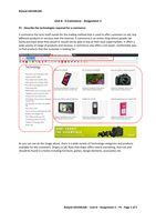
Home page -
Instructions
The home page can be
accessed from every
page via the back arrow-
Clues page QR Camera
button, the other pages
page
can be accessed by the
three buttons.
Answers page
Microsoft PowerPoint was used to create the app as it is a simple software that I could use to produce a prototype
without having to learn and/or utilise a more complex method. PowerPoint allows me to make any text or shapes
hyperlinked to different pages by right clicking, hyperlink, and ‘Place in this document’ to select the slide I want; this
creates buttons and linked text that can be used to navigate/interact with the interactive system while in slideshow.
There many effects I can use to format shapes, text, and images to achieve the aesthetic I want, such as the bevelled
buttons made to look like gold bars as treasure.
The interactive system is very simple to use; end users start on the home/instructions page where they can read how
the Treasure Trail works. They can then navigate to the Clues, Answers, or QR Camera page by pressing the
corresponding buttons at the bottom of the screen, which each have a back arrow that is a button to return to the
instructions page; on phone, they would be able to use their phones respective back button as well. On the clues
page, they would read the clues which are not on the prototype, there would be three for each park for three
different QRs they must find, then type the answers received from using the QR Camera/scanner (cannot be used in
prototype), and typing the answers into the correct slot on the answers page but PowerPoint does not allow users to
enter text on the slideshow.
My second interactive system had even less features that could be implemented using PowerPoint; the design from
the previous assignment was a touch-screen information board within the parks that allowed users to use a stylus to
press filters and navigate the map, clicking icons to gain more information on an attraction or facility. On my
interactive system, one part of the map has been used as an example instead of a scrollable map of the whole of
Disneyland Paris, with the same frame from the designs used without the labelled styluses and headphone jack. The
layout and screen design are the same with input/output being very similar so the design principles remain the
For my interactive systems, I used my designs of HCI for Disneyland Paris from the
previous assignment; the first interactive system – the QR Trail game was designed as
a treasure hunt through the various parks of Disneyland Paris that would have users
explore and potentially use rides or facilities along the way, increasing profits and
interactivity within the parks. In the design document, I stated the QR code would have
to be dynamic QR codes so the links change on a daily or weekly basis so that visitors
cannot just look up what the password is. The layout has remained the same with
slight changes such as an addition of an introduction page that tells the user how to
use the app, and the back arrow-buttons leading to this page instead of Disneyland’s
official app. I used a template image of a phone for borders of the screen to give a
better representation of how it would look and for the dimensions to use.
I designed it so every page is accessible from any page through the bottom buttons
and back arrow to the home page with instructions. I implemented the features to
assist users with specialist needs such as the buttons and text being large enough to
help users with visual impairments and makes features easier to press; while there is a
clear colour scheme of gold and white with black text that does not affect colour vision
impairments. The design principles I wrote about in the previous assignment for my
design are included as I did not change the layout so symmetry, proximity, the ‘pop-
out effect’ and other aspects are present.
Home page -
Instructions
The home page can be
accessed from every
page via the back arrow-
Clues page QR Camera
button, the other pages
page
can be accessed by the
three buttons.
Answers page
Microsoft PowerPoint was used to create the app as it is a simple software that I could use to produce a prototype
without having to learn and/or utilise a more complex method. PowerPoint allows me to make any text or shapes
hyperlinked to different pages by right clicking, hyperlink, and ‘Place in this document’ to select the slide I want; this
creates buttons and linked text that can be used to navigate/interact with the interactive system while in slideshow.
There many effects I can use to format shapes, text, and images to achieve the aesthetic I want, such as the bevelled
buttons made to look like gold bars as treasure.
The interactive system is very simple to use; end users start on the home/instructions page where they can read how
the Treasure Trail works. They can then navigate to the Clues, Answers, or QR Camera page by pressing the
corresponding buttons at the bottom of the screen, which each have a back arrow that is a button to return to the
instructions page; on phone, they would be able to use their phones respective back button as well. On the clues
page, they would read the clues which are not on the prototype, there would be three for each park for three
different QRs they must find, then type the answers received from using the QR Camera/scanner (cannot be used in
prototype), and typing the answers into the correct slot on the answers page but PowerPoint does not allow users to
enter text on the slideshow.
My second interactive system had even less features that could be implemented using PowerPoint; the design from
the previous assignment was a touch-screen information board within the parks that allowed users to use a stylus to
press filters and navigate the map, clicking icons to gain more information on an attraction or facility. On my
interactive system, one part of the map has been used as an example instead of a scrollable map of the whole of
Disneyland Paris, with the same frame from the designs used without the labelled styluses and headphone jack. The
layout and screen design are the same with input/output being very similar so the design principles remain the