100% satisfaction guarantee Immediately available after payment Both online and in PDF No strings attached 4.2 TrustPilot
logo-home
Exam (elaborations)

BUSI 201 Assignment 10 Excel 2016 Skill Review 7.1 Liberty University answers complete solutions

Rating
-
Sold
2
Pages
6
Grade
A+
Uploaded on
21-02-2021
Written in
2020/2021

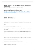
BUSI 201 Assignment 10 Excel 2016 Skill Review 7.1 Liberty University answers complete solutions Complete many different versions to get an A on your grade! Download it for more and ace on your assignments! Skill Review 7.1 3. Add Sparklines to the data and apply a Quick Style. a. On the Population Data worksheet, select cells B4:F13. b. On the Insert tab, in the Sparklines group, click the Column button. c. In the Create Sparklines dialog, verify that B4:F13 is the Data Range and specify G4:G13 as the Location Range. Click OK. d. On the Sparkline Tools Design tab, in the Style group, apply the Dark Blue, Sparkline Style Dark #6 style. Click the More button to expand the gallery, then click the first style from the right in the fifth row. 4. Change the Sparklines to lines with markers for all data points and highlight the high point marker in a different color. a. On the Sparkline Tools Design tab, in the Type group, click the Line button. b. On the Sparkline Tools Design tab, in the Show group, click the Markers check box. c. On the Sparkline Tools Design tab, in the Style group, click the Marker Color button, point to High Point, and select Red (the second color from the left in the row of standard colors). 5. Create a column chart to represent the population data for Dallas and then add a second series to represent the overall population of the United States. 6. Change the chart type to a combination chart with a secondary axis for the national population data. 7. Add a legend above the chart and format it by applying a style. 8. Change the fill color of a data point to make it stand out. a. Select the data point for 1990 for the series Dallas, TX by clicking the 1990 column once to select the series and then clicking it a second time to select just that data point. b. On the Chart Tools Format tab, in the Shape Styles group, click the Shape Fill button and select Red, Accent 2 (the fifth color from the right in the first row of theme colors). 9. Save this chart as a new chart template. 10. Add a callout to the chart, apply a style to it, and add text. 11. Create a new chart from the template you saved. a. Select cells A3:F4. Press [Ctrl] and click and drag to select cells A12:F12. b. On the Insert tab, in the Charts group, click the dialog launcher to open the Insert Chart dialog. c. In the Insert Chart dialog, click the All Charts tab. d. Click Templates. If necessary, select the Population Combo Chart template. f. If necessary, move the chart so it is positioned to the right of the first chart as shown in Figure EX 7.62. 12. Change the outline color of a data series. a. Select the New York, NY data series by clicking any column in the second chart. 13. Create a clustered column chart for population growth by region. Move the chart to its own chart sheet named Regional Trends. 14. Edit and format the chart title. 15. Add trendlines to the chart to forecast exponential growth for the next 40 years. h. Right-click any data point in the Midwest series and select Add Trendline.... Apply the same formatting options as you applied to the Northeast trendline: exponential, forecasting forward for 4 periods, 4 pt width, and arrow type End Arrow. i. Follow the same steps to add a trendline to each of the other data series using the same formatting options (exponential, forecasting forward for 4 periods, 4 pt width, and arrow type End Arrow). The final chart should look similar to Figure EX 7.63.

Show more Read less


Whoops! We can’t load your doc right now. Try again or contact support.

Document information

Uploaded on
February 21, 2021
Number of pages
6
Written in
2020/2021
Type
Exam (elaborations)
Contains
Questions & answers

Subjects

  • select cells b

Get to know the seller

Seller avatar
Reputation scores are based on the amount of documents a seller has sold for a fee and the reviews they have received for those documents. There are three levels: Bronze, Silver and Gold. The better the reputation, the more your can rely on the quality of the sellers work.
grademaster Chamberlain School Of Nursing
View profile
Follow You need to be logged in order to follow users or courses
Sold
648
Member since
5 year
Number of followers
618
Documents
105
Last sold
1 week ago
Quality Exams is Key to Students Career Excellence

Welcome to my World. I'm here to create a hassle-free experience by making available, up-to-date and recent study materials. I wish you great and easy learning through your course. Kindly message me if you can't find your tutorial and I will help you. #alittlehelpgoesalongway

4.3

73 reviews

5
47
4
14
3
3
2
2
1
7

Recently viewed by you

Why students choose Stuvia

Created by fellow students, verified by reviews

Quality you can trust: written by students who passed their exams and reviewed by others who've used these notes.

Didn't get what you expected? Choose another document

No worries! You can immediately select a different document that better matches what you need.

Pay how you prefer, start learning right away

No subscription, no commitments. Pay the way you're used to via credit card or EFT and download your PDF document instantly.

Student with book image

“Bought, downloaded, and aced it. It really can be that simple.”

Alisha Student

Frequently asked questions