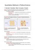
Quantitative Methods in Political Science
1. Random Variables: Main Concepts, Graphs
Statistics is the science that studies how to reach conclusions from data observation
(collection, analysis, and interpretation) through mathematical models.
- Two branches of statistics:
- Descriptive Statistics – graphical and numerical procedures to summarize and
process data.
- Statistical Inference – usingn data to make predictions, forecasts, and
estimates to assist decision-making.
A population is the collection of all items of A sample is an observed subset of the
interest or under investigation (N represents population (n represents the sample size).
the population size).
Parameter – a numerical measure that Statistic – a numerical measure that
describes a specific characteristic of a describes a specific characteristic of a
population sample
Types of sampling:
- Probabilistic or random sampling – each member of the population is chosen strictly
by chance.
- Non-probabilistic sampling – each member of the population is chosen based on the
researcher's criteria.
A variable is a characteristic that can vary in value among subjects in a sample or
population. If the possible outcomes are known, but it’s uncertain which will occur, we have a
random variable.
- Correctly classifying variables is an important first step to selecting the correct
statistical procedure needed to analyze and interpret data.
Types of random variables
- Numerical variables can take a wide range of numerical values, and it is sensible to
add, subtract, or take averages with those values.
- Discrete variables only take numerical values with gaps in between them (e.g.
number of children)
, - Continuous variables do not take numerical values with gaps in between them
(e.g. weight, time)
- Categorial variables
- Ordinal variables are categorical variables with levels that have a natural
ordering (levels). (e.g. level of education, satisfaction)
- The Likert scale is a type of rating scale used to measure attitudes,
opinions, or beliefs. It’s an ordinal variable.
- Widely used in surveys and questionnaires.
- Typically has a range of labels such as: “strongly disagree” or
“never” to“strongly agree” or “always”.
- Usually has five or seven labels.
- Note: If the categorical variable has “I don’t know” as an option, then it
is no longer ordinal because this option breaks the order. It is now a
nominal variable.
- Nominal variables are regular categorical variables without special ordering.
(e.g. eye color, religious affiliation)
A frequency distribution table contains class groupings (categories or ranges) and the
corresponding frequencies with which data fall within each class or category. It summarizes
data and allows for a quick visual interpretation of the data.
- Example: Crime rates in US states (quantitative, continuous variable)
- How to create a frequency distribution table:
1. Determine the number of intervals (between 5 and 15)
2. Find the range of the data (maximum value – minimum value)
3. Calculate the width of the intervals (ideally, all intervals have the same width)
,Graphs to describe categorical variables
A bar chart draws attention to the frequency A pie chart draws attention to the proportion
of each category. The height of the bar of frequencies in each category.
represents the frequency (absolute or
relative) of each category. The circle (pie) represents the total; the
parts (size of pie slices) depict shares of the
Bars cannot touch between them. total (frequency or % for each category).
Graphs to describe numerical variables
- Histogram examples:
Data presentation errors
1. The area of the rectangles on the histogram should be proportional to the frequency
of each data group.
Correct Incorrect
, 2. Axes can be distorted if they do not start at 0. If it does not make sense to start at
zero because of the data, add a break in the axis.
3. The scales for all the data groups should be the same to avoid distorting proportions.
4. 3D representations can distort the proportions of the data. Stick with 2D models.
2. Central Tendency and Variability Measures
Measures of central tendency and location
Mean – the arithmetic average.
- Example 1:
- Example 2:

