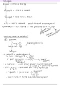
Topic: Psychology- Data analysis graphs
Key points/ Notes/Diagrams:
Main Ideas/
All represent data
Questions:
Summary Table- Tables like this rarely include raw scores- they will have been
What is a summary converted to descriptive statistics.
table?
Bar Charts- Data is divided into different categories
What is a bar chart? - Discrete data
- The difference in mean values can easily be seen
What is a - Horizontal x-axis
scattergram? - Vertical y-axis
What is a histogram? Scattergrams- They show the correlation between co-variables
- They don’t show differences
What is a line graph?
Histograms- The bars touch each other which shows the data is continuous rather
What is data than discrete (as in a bar graph)
distribution? - The x axis is made up of equal sized intervals (e.g percentage change
scores in a maths test).
What are the two - The y axis represents the frequency (number of people who scored a certain
types of data mark within each interval).
distribution?
Line Graph- Represents continuous data
What are the two - Each point in the data is connected by a line
types of skewed - The line shows how something changes over time (e.g memory over a day)
distribution? What do
they look like from Data Distribution- When we plot data the y-axis represents frequency and the x-axis
one another? is the item of interest. When doing this for large data sets we can see the overall
pattern of the data called a distribution.
- Normal distribution- A classic bell-shaped curve
● The data is symmetrical
● Mean, median and mode are found in the mid-point
- Skewed distribution- In some populations scores are not distributed
equally around the mean. Most people would have an “average income” but
a few extreme high incomes can affect the mean.
● Positive skew- where most of the distribution is concentrated
towards the left of the graph.
● Negative skew- Where most of the distribution is concentrated
towards the right of the graph.
Summary:
Summary tables rarely feature raw sets of data so they would be converted into descriptive statistics.
Bar charts- discrete data
Scattergrams- They show the correlation between co variables (no difference)
Histograms- The bars touch each other which shows the data is continuous rather than discrete.
Line Graph- Represents continuous data
Data distribution- do this for large sets of data to see the overall pattern of data (distribution)