Review
My website meets the client requests as it works and
showcases the john haynes foundation and their work
and also added a contact page which enables the user
to contact and get in touch with the foundation if they
want to volunteer for them or if they want to get more
information about the foundation, I have also social
media links for the social media platform that the for
destination have accounts on such as Facebook and
Twitter. So, when the user clicks on one of the icons
the website will direct them to the targeted social
media platform which shows the work that the
foundation does as well as events alongside their
partners that they work alongside with.
After I tested the website, I also visited it again for me
to review it and I am pleased that I meet the
expectations that the clients requested from me. The
website effectively shows the john haynes foundation
and their remarkable work, the layout and design are
visually appealing which helps to get the user’s
attention which means it will drive more traffic to the
website.
, P3
the home and about page are the same. you need to
add an image to the home, about page, news page and
gallery page. you could add the social media links on all
the pages.
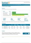
This is the feedback that received from my classmates
after looking at my website. After I received the
feedback, I went back and changed a bit in my website
and added all the necessary things I needed to add to
make my website look better.
I changed the home page and the About page so they
don’t the same each other anymore and I also have
added different images on both pages. I have also
added a footer to my web pages in my website and
also social media links, to reflect upon the feedback
that I have received.
Justification
As the website designer, I made specific design
decisions to ensure that the website meets the needs
of the users and effectively represents the John Haynes
Foundation. Here is my justification for these design
choices:
My website meets the client requests as it works and
showcases the john haynes foundation and their work
and also added a contact page which enables the user
to contact and get in touch with the foundation if they
want to volunteer for them or if they want to get more
information about the foundation, I have also social
media links for the social media platform that the for
destination have accounts on such as Facebook and
Twitter. So, when the user clicks on one of the icons
the website will direct them to the targeted social
media platform which shows the work that the
foundation does as well as events alongside their
partners that they work alongside with.
After I tested the website, I also visited it again for me
to review it and I am pleased that I meet the
expectations that the clients requested from me. The
website effectively shows the john haynes foundation
and their remarkable work, the layout and design are
visually appealing which helps to get the user’s
attention which means it will drive more traffic to the
website.
, P3
the home and about page are the same. you need to
add an image to the home, about page, news page and
gallery page. you could add the social media links on all
the pages.
This is the feedback that received from my classmates
after looking at my website. After I received the
feedback, I went back and changed a bit in my website
and added all the necessary things I needed to add to
make my website look better.
I changed the home page and the About page so they
don’t the same each other anymore and I also have
added different images on both pages. I have also
added a footer to my web pages in my website and
also social media links, to reflect upon the feedback
that I have received.
Justification
As the website designer, I made specific design
decisions to ensure that the website meets the needs
of the users and effectively represents the John Haynes
Foundation. Here is my justification for these design
choices: