Module 1
Learning Objectives
Get to the point using the direct strategy
Use the 3x3 process
Prepare professional email messages
Improve document readability
The Direct Strategy
For routine business, you should use direct strategy.
To order people; be direct and polite
For your writing to be audience-oriented, you will have to take the time to think
about who your audience is and how they will probably respond to your
communication.
Audience response determines the strategy:
- Use a direct strategy for receptive audiences.
- Use an indirect strategy for unreceptive audiences.
Using Direct Pattern:
Use the direct pattern when you expect the reader to be pleased, mildly interested,
or, at worst, neutral. Put your main point—the purpose of your message—in the first
or second sentence.
The direct pattern saves the reader’s time, creates a proper frame of mind, and
reduces frustration by frontloading the main idea.
Page | 1
,Using Indirect Pattern:
When you expect the audience to be uninterested, unwilling, displeased, or perhaps
even hostile, the indirect pattern is more appropriate. In this pattern, you don’t
reveal the main idea until after you have offered explanation or evidence.
This approach works well for bad news, persuasion, and sensitive news.
The 3x3 Process
Page | 2
,Improve document readability
What is white space and why is it important for readability?
White space on a page is empty space. Pages that are crammed full of text or graphics
appear busy, cluttered, unreadable, and off-putting.
Left justify text, leave right ragged. Text which is both right and left justified requires
more attention to word spacing and hyphenation to avoid awkward empty spaces
running through the document. When right margins are ragged—without alignment or
justification—they provide more white space and improve readability.
A typeface defines the shape of text characters. For most business messages, you
should choose sans serif categories.
- Sans serif typefaces include Arial, Calibri, Gothic, Tahoma, Helvetica, and
Univers. These clean characters are widely used for headings, signs, and
material that does not require continuous reading.
- All-purpose sans serif typefaces are most appropriate for business messages.
Generally, use no more than one typefaces within one document.
How do bulleted and numbered lists improve readability?
Numbered lists
- Use for high “skim value.”
- Use for items that represent a sequence or reflect a numbering systems.
Bulleted lists
- Use to highlight items that don’t necessarily show a chronology.
Capitalization
- Capitalize the initial word in each line.
Parallelism
- Make all the lines consistent. For example, start each with a verb.
Page | 3
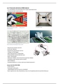
, Notice the use of white space in the design of this email:
Page | 4
Learning Objectives
Get to the point using the direct strategy
Use the 3x3 process
Prepare professional email messages
Improve document readability
The Direct Strategy
For routine business, you should use direct strategy.
To order people; be direct and polite
For your writing to be audience-oriented, you will have to take the time to think
about who your audience is and how they will probably respond to your
communication.
Audience response determines the strategy:
- Use a direct strategy for receptive audiences.
- Use an indirect strategy for unreceptive audiences.
Using Direct Pattern:
Use the direct pattern when you expect the reader to be pleased, mildly interested,
or, at worst, neutral. Put your main point—the purpose of your message—in the first
or second sentence.
The direct pattern saves the reader’s time, creates a proper frame of mind, and
reduces frustration by frontloading the main idea.
Page | 1
,Using Indirect Pattern:
When you expect the audience to be uninterested, unwilling, displeased, or perhaps
even hostile, the indirect pattern is more appropriate. In this pattern, you don’t
reveal the main idea until after you have offered explanation or evidence.
This approach works well for bad news, persuasion, and sensitive news.
The 3x3 Process
Page | 2
,Improve document readability
What is white space and why is it important for readability?
White space on a page is empty space. Pages that are crammed full of text or graphics
appear busy, cluttered, unreadable, and off-putting.
Left justify text, leave right ragged. Text which is both right and left justified requires
more attention to word spacing and hyphenation to avoid awkward empty spaces
running through the document. When right margins are ragged—without alignment or
justification—they provide more white space and improve readability.
A typeface defines the shape of text characters. For most business messages, you
should choose sans serif categories.
- Sans serif typefaces include Arial, Calibri, Gothic, Tahoma, Helvetica, and
Univers. These clean characters are widely used for headings, signs, and
material that does not require continuous reading.
- All-purpose sans serif typefaces are most appropriate for business messages.
Generally, use no more than one typefaces within one document.
How do bulleted and numbered lists improve readability?
Numbered lists
- Use for high “skim value.”
- Use for items that represent a sequence or reflect a numbering systems.
Bulleted lists
- Use to highlight items that don’t necessarily show a chronology.
Capitalization
- Capitalize the initial word in each line.
Parallelism
- Make all the lines consistent. For example, start each with a verb.
Page | 3
, Notice the use of white space in the design of this email:
Page | 4