
WGU C784 Applied Healthcare Statistics Final Exam 2026/2027 | Page 1 | Passing Score: 80%
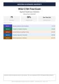
WESTERN GOVERNORS UNIVERSITY
WGU C784 Final Exam
Applied Healthcare Statistics
Official Exam 2026/2027
75 80% One-Time Cert
QUESTIONS PASSING SCORE RECERTIFICATION
TABLE OF CONTENTS
Section 1 Descriptive Statistics & Data Visualization Q1-Q15
Section 2 Probability & Probability Distributions Q16-Q30
Section 3 Inferential Statistics & Hypothesis Testing Q31-Q45
Section 4 Correlation, Regression & Association Q46-Q60
Section 5 Statistical Applications in Healthcare Q61-Q75
Instructions: Select the single best answer for each question. This exam is designed for WGU C784 Applied Healthcare Statistics
WGU C784 Applied Healthcare Statistics Final Exam - 2026/2027 | Passing Score: 80% | Page 1 of 39
, SECTION 1 | Descriptive Statistics & Data Visualization | Q1-Q15 | WGU C784 Statistics 2026/2027
Q1 Question 1 of 75
A hospital administrator reviews the lengths of stay for 200 patients discharged last month
and wants to summarize the central tendency of this data. The distribution is right-skewed
because a few patients stayed significantly longer than the rest. A colleague recommends
using the mean, but the administrator is uncertain. Which measure of central tendency is most
appropriate for this right-skewed distribution?
A. Mean, because it uses all data points and provides the most complete summary
B. Range, because it captures the full spread of data including extreme values
C. Mode, because it identifies the most frequent length of stay in the dataset
D. Median, because it is resistant to extreme values and represents the typical stay
Correct Answer: D
Rationale:
The median is the most appropriate measure for right-skewed data because it is not influenced by extreme
values or outliers. The mean would be pulled upward by the long stays, giving a misleading representation
of the typical patient experience. The mode only identifies the most frequent value and ignores the overall
distribution, while the range measures spread rather than central tendency.
Q2 Question 2 of 75
A nurse manager is analyzing the systolic blood pressure readings of 50 patients in a cardiac
unit. After plotting the data, she observes a symmetric, bell-shaped distribution. She
calculates the mean as 128 mmHg and the standard deviation as 12 mmHg. Approximately
what percentage of patients would be expected to have readings between 116 and 140
mmHg?
A. 68%, because this range represents one standard deviation above and below the mean
B. 50%, because half the data falls above and below the mean in any distribution
C. 95%, because nearly all data falls within two standard deviations
D. 99.7%, because virtually all data falls within three standard deviations
Correct Answer: A
Rationale:
In a normal distribution, approximately 68% of data falls within one standard deviation of the mean. The
range 116 to 140 mmHg represents one standard deviation below and above the mean (128 minus 12 and
128 plus 12). The 95% rule applies to two standard deviations, and 99.7% applies to three standard
deviations.
WGU C784 Applied Healthcare Statistics Final Exam - 2026/2027 | Passing Score: 80% | Page 2 of 39
, SECTION 1 | Descriptive Statistics & Data Visualization | Q1-Q15 | WGU C784 Statistics 2026/2027
Q3 Question 3 of 75
A public health researcher collects data on the number of new COVID-19 cases reported in a
county over a 30-day period. She wants to create a visual display that shows the daily trend
and allows viewers to easily identify peaks and valleys in case counts. Which type of chart is
most suitable for this purpose?
A. Pie chart, because it shows the proportion of cases each day
B. Line chart, because it connects consecutive data points to reveal trends over time
C. Bar chart, because it compares categories side by side
D. Scatter plot, because it displays individual data points without connecting them
Correct Answer: B
Rationale:
A line chart is the most suitable for displaying trends over time because it connects consecutive data points
with lines, making it easy to visualize increases, decreases, peaks, and valleys. A pie chart shows
proportions of a whole, a bar chart compares categories, and a scatter plot shows relationships between two
variables rather than trends over time.
Q4 Question 4 of 75
A quality improvement team at a clinic wants to display the distribution of patient wait times.
They have 500 observations ranging from 5 minutes to 75 minutes and want to see the
frequency of wait times within equal intervals. The team needs a chart that clearly shows the
shape and spread of the distribution. Which visualization should they use?
A. Pie chart, because it shows proportions of different wait time categories
B. Box plot, because it summarizes the five-number summary of the data
C. Histogram, because it displays the frequency distribution of continuous data using adjacent
bars
D. Frequency table only, because it provides the most detailed numerical summary
Correct Answer: C
Rationale:
A histogram is the best choice for displaying the distribution of a continuous quantitative variable because it
shows the frequency of observations within equal intervals using adjacent bars. A pie chart is for categorical
data, a box plot summarizes but does not show the full distribution shape in detail, and a frequency table
alone is not a visual display.
WGU C784 Applied Healthcare Statistics Final Exam - 2026/2027 | Passing Score: 80% | Page 3 of 39
, SECTION 1 | Descriptive Statistics & Data Visualization | Q1-Q15 | WGU C784 Statistics 2026/2027
Q5 Question 5 of 75
A researcher compares the interquartile range (IQR) and the standard deviation for a dataset
of patient body temperatures. The IQR is 1.2 degrees Fahrenheit and the standard deviation
is 0.9 degrees Fahrenheit. The researcher notices that the standard deviation is smaller
relative to the IQR than expected. What does this most likely indicate about the distribution?
A. The distribution is perfectly symmetric with equal spread on both sides
B. The distribution is uniform across all values with no concentration of data
C. The distribution has no variability and all values are nearly identical
D. The distribution has outliers in the tails that inflate the IQR relative to the standard deviation
Correct Answer: D
Rationale:
The IQR measures the spread of the middle 50% of the data and is resistant to outliers, while the standard
deviation is influenced by all data points including extreme values. When the IQR is disproportionately large
relative to the standard deviation, it often indicates that the data has heavy tails or outliers that widen the
middle spread while the overall standard deviation remains moderate. This pattern is characteristic of
distributions with outlier influence.
Q6 Question 6 of 75
A data analyst at a health department creates a bar chart showing the top five causes of
death in a state. She wants to enhance the chart by adding visual elements that help the
viewer quickly compare the magnitudes. She decides to add data labels at the top of each
bar. What is the primary advantage of adding data labels to a bar chart in a healthcare report?
A. They allow precise values to be read directly without referencing the vertical axis
B. They replace the need for axis labels entirely, simplifying the chart design
C. They change the chart from a descriptive display to an inferential analysis tool
D. They eliminate the need for a legend by encoding all information in the labels
Correct Answer: A
Rationale:
Data labels placed at the top of each bar allow the reader to see exact values without having to trace back to
the vertical axis, improving readability and precision. They do not replace axis labels, which still provide
context for the scale. Data labels do not change the nature of the chart from descriptive to inferential, and
they are not related to the need for a legend.
WGU C784 Applied Healthcare Statistics Final Exam - 2026/2027 | Passing Score: 80% | Page 4 of 39
WESTERN GOVERNORS UNIVERSITY
WGU C784 Final Exam
Applied Healthcare Statistics
Official Exam 2026/2027
75 80% One-Time Cert
QUESTIONS PASSING SCORE RECERTIFICATION
TABLE OF CONTENTS
Section 1 Descriptive Statistics & Data Visualization Q1-Q15
Section 2 Probability & Probability Distributions Q16-Q30
Section 3 Inferential Statistics & Hypothesis Testing Q31-Q45
Section 4 Correlation, Regression & Association Q46-Q60
Section 5 Statistical Applications in Healthcare Q61-Q75
Instructions: Select the single best answer for each question. This exam is designed for WGU C784 Applied Healthcare Statistics
WGU C784 Applied Healthcare Statistics Final Exam - 2026/2027 | Passing Score: 80% | Page 1 of 39
, SECTION 1 | Descriptive Statistics & Data Visualization | Q1-Q15 | WGU C784 Statistics 2026/2027
Q1 Question 1 of 75
A hospital administrator reviews the lengths of stay for 200 patients discharged last month
and wants to summarize the central tendency of this data. The distribution is right-skewed
because a few patients stayed significantly longer than the rest. A colleague recommends
using the mean, but the administrator is uncertain. Which measure of central tendency is most
appropriate for this right-skewed distribution?
A. Mean, because it uses all data points and provides the most complete summary
B. Range, because it captures the full spread of data including extreme values
C. Mode, because it identifies the most frequent length of stay in the dataset
D. Median, because it is resistant to extreme values and represents the typical stay
Correct Answer: D
Rationale:
The median is the most appropriate measure for right-skewed data because it is not influenced by extreme
values or outliers. The mean would be pulled upward by the long stays, giving a misleading representation
of the typical patient experience. The mode only identifies the most frequent value and ignores the overall
distribution, while the range measures spread rather than central tendency.
Q2 Question 2 of 75
A nurse manager is analyzing the systolic blood pressure readings of 50 patients in a cardiac
unit. After plotting the data, she observes a symmetric, bell-shaped distribution. She
calculates the mean as 128 mmHg and the standard deviation as 12 mmHg. Approximately
what percentage of patients would be expected to have readings between 116 and 140
mmHg?
A. 68%, because this range represents one standard deviation above and below the mean
B. 50%, because half the data falls above and below the mean in any distribution
C. 95%, because nearly all data falls within two standard deviations
D. 99.7%, because virtually all data falls within three standard deviations
Correct Answer: A
Rationale:
In a normal distribution, approximately 68% of data falls within one standard deviation of the mean. The
range 116 to 140 mmHg represents one standard deviation below and above the mean (128 minus 12 and
128 plus 12). The 95% rule applies to two standard deviations, and 99.7% applies to three standard
deviations.
WGU C784 Applied Healthcare Statistics Final Exam - 2026/2027 | Passing Score: 80% | Page 2 of 39
, SECTION 1 | Descriptive Statistics & Data Visualization | Q1-Q15 | WGU C784 Statistics 2026/2027
Q3 Question 3 of 75
A public health researcher collects data on the number of new COVID-19 cases reported in a
county over a 30-day period. She wants to create a visual display that shows the daily trend
and allows viewers to easily identify peaks and valleys in case counts. Which type of chart is
most suitable for this purpose?
A. Pie chart, because it shows the proportion of cases each day
B. Line chart, because it connects consecutive data points to reveal trends over time
C. Bar chart, because it compares categories side by side
D. Scatter plot, because it displays individual data points without connecting them
Correct Answer: B
Rationale:
A line chart is the most suitable for displaying trends over time because it connects consecutive data points
with lines, making it easy to visualize increases, decreases, peaks, and valleys. A pie chart shows
proportions of a whole, a bar chart compares categories, and a scatter plot shows relationships between two
variables rather than trends over time.
Q4 Question 4 of 75
A quality improvement team at a clinic wants to display the distribution of patient wait times.
They have 500 observations ranging from 5 minutes to 75 minutes and want to see the
frequency of wait times within equal intervals. The team needs a chart that clearly shows the
shape and spread of the distribution. Which visualization should they use?
A. Pie chart, because it shows proportions of different wait time categories
B. Box plot, because it summarizes the five-number summary of the data
C. Histogram, because it displays the frequency distribution of continuous data using adjacent
bars
D. Frequency table only, because it provides the most detailed numerical summary
Correct Answer: C
Rationale:
A histogram is the best choice for displaying the distribution of a continuous quantitative variable because it
shows the frequency of observations within equal intervals using adjacent bars. A pie chart is for categorical
data, a box plot summarizes but does not show the full distribution shape in detail, and a frequency table
alone is not a visual display.
WGU C784 Applied Healthcare Statistics Final Exam - 2026/2027 | Passing Score: 80% | Page 3 of 39
, SECTION 1 | Descriptive Statistics & Data Visualization | Q1-Q15 | WGU C784 Statistics 2026/2027
Q5 Question 5 of 75
A researcher compares the interquartile range (IQR) and the standard deviation for a dataset
of patient body temperatures. The IQR is 1.2 degrees Fahrenheit and the standard deviation
is 0.9 degrees Fahrenheit. The researcher notices that the standard deviation is smaller
relative to the IQR than expected. What does this most likely indicate about the distribution?
A. The distribution is perfectly symmetric with equal spread on both sides
B. The distribution is uniform across all values with no concentration of data
C. The distribution has no variability and all values are nearly identical
D. The distribution has outliers in the tails that inflate the IQR relative to the standard deviation
Correct Answer: D
Rationale:
The IQR measures the spread of the middle 50% of the data and is resistant to outliers, while the standard
deviation is influenced by all data points including extreme values. When the IQR is disproportionately large
relative to the standard deviation, it often indicates that the data has heavy tails or outliers that widen the
middle spread while the overall standard deviation remains moderate. This pattern is characteristic of
distributions with outlier influence.
Q6 Question 6 of 75
A data analyst at a health department creates a bar chart showing the top five causes of
death in a state. She wants to enhance the chart by adding visual elements that help the
viewer quickly compare the magnitudes. She decides to add data labels at the top of each
bar. What is the primary advantage of adding data labels to a bar chart in a healthcare report?
A. They allow precise values to be read directly without referencing the vertical axis
B. They replace the need for axis labels entirely, simplifying the chart design
C. They change the chart from a descriptive display to an inferential analysis tool
D. They eliminate the need for a legend by encoding all information in the labels
Correct Answer: A
Rationale:
Data labels placed at the top of each bar allow the reader to see exact values without having to trace back to
the vertical axis, improving readability and precision. They do not replace axis labels, which still provide
context for the scale. Data labels do not change the nature of the chart from descriptive to inferential, and
they are not related to the need for a legend.
WGU C784 Applied Healthcare Statistics Final Exam - 2026/2027 | Passing Score: 80% | Page 4 of 39


