JAMOVI - INSTRUCTIONS + REPORTING + EXAMPLES
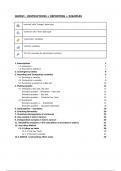
nominal’ with ‘Integer’ data type
‘nominal’ with ‘Text’ data type
‘scale/ratio’ variables
‘ordinal’ variables
‘ID’ (for example for participant number).
1. Descriptives 2
1.1 Histogram 2
1.2 Descriptive statistics 3
2. Contingency tables 4
3. Recoding and Computing variables 5
3.1 Recoding a variable 5
3.2 Computing a variable 8
3.3 Extracting a subset of a data set 10
4. Making graphs 13
4.1 Histogram, Box plot, Bar plot 13
Example question - Histogram + Box plot 14
Example question - Bar plot 15
Example question - Clustered bar chart 15
4.2 Scatterplot 16
Example question 1 - Scatterplot 17
Example question - Grouped scatterplot 18
5. Assumptions - examples 19
6. Checking Normality 20
7. Checking Homogeneity of variances 22
8. One-sample t-test in Jamovi 23
9. Independent samples t-test in Jamovi 26
11. Reliability analysis (= the calculation of Cronbach’s alpha) 31
12. One-Way ANOVA 34
12.1 Follow up tests 38
12.1.1 Post Hoc Tests 38
12.1.2 Planned Contrasts 41
12.2 ANOVA | Calculating effect sizes 45
,1. Descriptives
Frequencies of one or several variables (mostly categorical variables = nominal)
Instruction: "Analyses" > “Exploration” > “Descriptives”
1. Select the variable that you want to
analyze and move it to “Variables”
2. ✅ “Frequency tables” to display the
frequencies
1.1 Histogram
1. Move the variable into the 'Variables' column.
2. Click on 'Plots' and ✅ 'Histogram' under Histograms
The bars in the graph show how often each category occurs (Y-axis). Remember, the numbers
on the X-axis (2, 4, 6) represent categories, not the actual number of hours studied.
For instance, this graph is not normally distributed. It's heavily skewed because many students
chose category 6, indicating "5 hours or more per week”.
,1.2 Descriptive statistics
➔ ONLY scale-variables
➔ Calculating means, standard deviations, ranges etc.
'I am worried about failing the course' with a 5-point
scale (ranging from 'completely disagree' to
'completely agree')
Range = 4 (max - min: 5-1)
Mean (3.31) = moderately' worried
SD (.955) = .955 < 3.31 AND .995 > 3.31
SD: most students responded between options 2 & 4
Reporting descriptives
In total, 94 respondents from 9 different countries completed the survey (21 males and 73
females). Their mean age was 22.40 years (SD = 3.88). Of these respondents, 12 did a language
related bachelor, 27 did a media related bachelor, and 55 did a different bachelor (or did not do a
bachelor yet). On average, respondents drink 5.8 units of alcohol per week (SD = 6.3) and
their average score to the question whether they are good at math is 3.15 (SD = 1.20).
Male respondents drink more units of alcohol per week (M = 8.6, SD = 6.5) than female
respondents (M = 4.9, SD = 6.0). Their mean score on the LexTale test of English was 74.35
(SD = 11.02).
, 2. Contingency tables
➔ Combining frequencies (statistics of 1 variable in terms of a 2nd
variable): e.g. how many of the boys are bachelors.
Option 1
1. Analyses ➔ Frequencies
➔ Independent Samples
2. Enter variables into ‘Rows’ and ‘Columns’
Which one you put in the Rows and which
one in Columns is irrelevant, the
information is identical.
Option 2
1. Analyses ➔ Exploration ➔ Descriptives
2. Select the variable (DV) that you want to
analyze and move it to “Variables”
3. Add the (nominal) variable that you want
to compare in the ‘Split by’ column.
Use ‘Variables across rows’ option in the
dropdown menu instead of ‘Variables across
columns’ for better readability.
3. ✅ “Frequency tables” to display the
frequencies
nominal’ with ‘Integer’ data type
‘nominal’ with ‘Text’ data type
‘scale/ratio’ variables
‘ordinal’ variables
‘ID’ (for example for participant number).
1. Descriptives 2
1.1 Histogram 2
1.2 Descriptive statistics 3
2. Contingency tables 4
3. Recoding and Computing variables 5
3.1 Recoding a variable 5
3.2 Computing a variable 8
3.3 Extracting a subset of a data set 10
4. Making graphs 13
4.1 Histogram, Box plot, Bar plot 13
Example question - Histogram + Box plot 14
Example question - Bar plot 15
Example question - Clustered bar chart 15
4.2 Scatterplot 16
Example question 1 - Scatterplot 17
Example question - Grouped scatterplot 18
5. Assumptions - examples 19
6. Checking Normality 20
7. Checking Homogeneity of variances 22
8. One-sample t-test in Jamovi 23
9. Independent samples t-test in Jamovi 26
11. Reliability analysis (= the calculation of Cronbach’s alpha) 31
12. One-Way ANOVA 34
12.1 Follow up tests 38
12.1.1 Post Hoc Tests 38
12.1.2 Planned Contrasts 41
12.2 ANOVA | Calculating effect sizes 45
,1. Descriptives
Frequencies of one or several variables (mostly categorical variables = nominal)
Instruction: "Analyses" > “Exploration” > “Descriptives”
1. Select the variable that you want to
analyze and move it to “Variables”
2. ✅ “Frequency tables” to display the
frequencies
1.1 Histogram
1. Move the variable into the 'Variables' column.
2. Click on 'Plots' and ✅ 'Histogram' under Histograms
The bars in the graph show how often each category occurs (Y-axis). Remember, the numbers
on the X-axis (2, 4, 6) represent categories, not the actual number of hours studied.
For instance, this graph is not normally distributed. It's heavily skewed because many students
chose category 6, indicating "5 hours or more per week”.
,1.2 Descriptive statistics
➔ ONLY scale-variables
➔ Calculating means, standard deviations, ranges etc.
'I am worried about failing the course' with a 5-point
scale (ranging from 'completely disagree' to
'completely agree')
Range = 4 (max - min: 5-1)
Mean (3.31) = moderately' worried
SD (.955) = .955 < 3.31 AND .995 > 3.31
SD: most students responded between options 2 & 4
Reporting descriptives
In total, 94 respondents from 9 different countries completed the survey (21 males and 73
females). Their mean age was 22.40 years (SD = 3.88). Of these respondents, 12 did a language
related bachelor, 27 did a media related bachelor, and 55 did a different bachelor (or did not do a
bachelor yet). On average, respondents drink 5.8 units of alcohol per week (SD = 6.3) and
their average score to the question whether they are good at math is 3.15 (SD = 1.20).
Male respondents drink more units of alcohol per week (M = 8.6, SD = 6.5) than female
respondents (M = 4.9, SD = 6.0). Their mean score on the LexTale test of English was 74.35
(SD = 11.02).
, 2. Contingency tables
➔ Combining frequencies (statistics of 1 variable in terms of a 2nd
variable): e.g. how many of the boys are bachelors.
Option 1
1. Analyses ➔ Frequencies
➔ Independent Samples
2. Enter variables into ‘Rows’ and ‘Columns’
Which one you put in the Rows and which
one in Columns is irrelevant, the
information is identical.
Option 2
1. Analyses ➔ Exploration ➔ Descriptives
2. Select the variable (DV) that you want to
analyze and move it to “Variables”
3. Add the (nominal) variable that you want
to compare in the ‘Split by’ column.
Use ‘Variables across rows’ option in the
dropdown menu instead of ‘Variables across
columns’ for better readability.
3. ✅ “Frequency tables” to display the
frequencies