Summary: BIM Research Methods
RSM Erasmus University Rotterdam: BM06BIM
This summary contains lectures for Session 1-6 for the end term of BRM 2023 taught by Dominik Gutt.
You can always text me if you have any comments or questions! Good luck! – Maaike
Table of Contents
Session 1 – Econometrics I: Part I – Plots...................................................................................................... 2
Session 1 – Econometrics I: Part II – Linear Regression.................................................................................. 3
Session 2 – Econometrics II: Part I – Panel Data ............................................................................................ 6
Session 2 – Econometrics II: Part II – Logistic Regression ............................................................................... 9
Session 3 – Case Study Research: Guest Lecture Eric van Heck .................................................................... 11
Session 4 – Econometrics III: Part I – Experiments ...................................................................................... 14
Session 4 – Econometrics III: Part II – Experiments ..................................................................................... 17
Session 5 – Econometrics IV: Part I............................................................................................................. 19
Session 5 – Econometrics IV: Part II............................................................................................................ 21
Session 6 – Collecting Data Using Surveys .................................................................................................. 22
Sample Questions ..................................................................................................................................... 29
1
,Session 1 – Econometrics I: Part I – Plots
Levels of data measurement:
• Nominal: data can only be categorized (e.g., names, political, affiliation)
• Ordinal: data can be categorized and ranked (small, medium, large fries)
• Interval: data can be categorized and ranked, and evenly spaced (temperature in degrees
Celsius, salary differences; can be less < 0)
• Ratio: data can be categorized, ranked, evenly spaced, and has a ‘natural’ zero (e.g., length,
salary – cannot be minus)
Visualizing Data:
1. Histograms
Histograms help us to identify:
- The shape of the distribution
- Skew the mode of the distribution is either:
• Left (positive skew)
• Right (negative skew)
- Kurtosis (when your distribution is very pointy)
- Spread or variation in scores
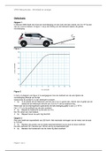
Example: A biologist was worried about potential health effects
of music festivals. → Measured hygiene of 810 concert-goers
over three days of festival. → Hygiene was measured using
standardized technique: score ranges from 0-4 (0= horrible, 4=roses)
= Ordinal measurement.
2. Bar chart: two independent variables
For mean comparison. The vertical lines around the mean are the
confidence intervals. The error bar sticks out from the bar like a
whisker. It displays the precision of the mean in: (1) confidence
interval, (2) standard deviation (3) standard error of the mean.
3. Scatterplot
Simple scatterplot with Smooth Line Grouped scatterplot with Regression Line
In short: You can visualize your data with:
1. Histogram: skewness, pointiness, spread/variation, shape distribution.
2. Bar chart: mean comparison
3. Scatterplot: correlations/patterns.
2
, Session 1 – Econometrics I: Part II – Linear Regression
Dependent variable, independent variable, and Hypothesis:
Hypothesis
The early bird catches the worm.
Independent Variable
= The proposed cause
- A predictor variable
- manipulated variable (in experiments)
Whether a bird wakes up early or late to go get worms.
Dependent Variable
= The proposed effect
- An outcome variable
- Measured not manipulated (in experiments)
Whether the bird catches the worm or not
Simple Linear Regression
B1:
• Regression coefficient for the predictor
• Gradient (slope) of the regression line
• Direction/Strength of relationship (positive or negative) or magnitude
B0:
• Intercept (value of Y when X=0)
• Point at which the regression line crosses the Y-axis (ordinate)
Ordinary Least Squares (OLS) Regressions
The graph (left) shows a scatterplot of some data with a line representing the general trend. The vertical
lines (dotted) represent the differences (or residuals) between the line and the actual data.
Testing the model: 𝑹𝟐
= the proportion of variance accounted for by the regression model
• The Pearson Correlation Coefficient Squared
Usually between 0 and 1, and tells you that the regression line explains this proportion of variance
variation in Y. High 𝑹𝟐 does not mean that your model is better.
3
RSM Erasmus University Rotterdam: BM06BIM
This summary contains lectures for Session 1-6 for the end term of BRM 2023 taught by Dominik Gutt.
You can always text me if you have any comments or questions! Good luck! – Maaike
Table of Contents
Session 1 – Econometrics I: Part I – Plots...................................................................................................... 2
Session 1 – Econometrics I: Part II – Linear Regression.................................................................................. 3
Session 2 – Econometrics II: Part I – Panel Data ............................................................................................ 6
Session 2 – Econometrics II: Part II – Logistic Regression ............................................................................... 9
Session 3 – Case Study Research: Guest Lecture Eric van Heck .................................................................... 11
Session 4 – Econometrics III: Part I – Experiments ...................................................................................... 14
Session 4 – Econometrics III: Part II – Experiments ..................................................................................... 17
Session 5 – Econometrics IV: Part I............................................................................................................. 19
Session 5 – Econometrics IV: Part II............................................................................................................ 21
Session 6 – Collecting Data Using Surveys .................................................................................................. 22
Sample Questions ..................................................................................................................................... 29
1
,Session 1 – Econometrics I: Part I – Plots
Levels of data measurement:
• Nominal: data can only be categorized (e.g., names, political, affiliation)
• Ordinal: data can be categorized and ranked (small, medium, large fries)
• Interval: data can be categorized and ranked, and evenly spaced (temperature in degrees
Celsius, salary differences; can be less < 0)
• Ratio: data can be categorized, ranked, evenly spaced, and has a ‘natural’ zero (e.g., length,
salary – cannot be minus)
Visualizing Data:
1. Histograms
Histograms help us to identify:
- The shape of the distribution
- Skew the mode of the distribution is either:
• Left (positive skew)
• Right (negative skew)
- Kurtosis (when your distribution is very pointy)
- Spread or variation in scores
Example: A biologist was worried about potential health effects
of music festivals. → Measured hygiene of 810 concert-goers
over three days of festival. → Hygiene was measured using
standardized technique: score ranges from 0-4 (0= horrible, 4=roses)
= Ordinal measurement.
2. Bar chart: two independent variables
For mean comparison. The vertical lines around the mean are the
confidence intervals. The error bar sticks out from the bar like a
whisker. It displays the precision of the mean in: (1) confidence
interval, (2) standard deviation (3) standard error of the mean.
3. Scatterplot
Simple scatterplot with Smooth Line Grouped scatterplot with Regression Line
In short: You can visualize your data with:
1. Histogram: skewness, pointiness, spread/variation, shape distribution.
2. Bar chart: mean comparison
3. Scatterplot: correlations/patterns.
2
, Session 1 – Econometrics I: Part II – Linear Regression
Dependent variable, independent variable, and Hypothesis:
Hypothesis
The early bird catches the worm.
Independent Variable
= The proposed cause
- A predictor variable
- manipulated variable (in experiments)
Whether a bird wakes up early or late to go get worms.
Dependent Variable
= The proposed effect
- An outcome variable
- Measured not manipulated (in experiments)
Whether the bird catches the worm or not
Simple Linear Regression
B1:
• Regression coefficient for the predictor
• Gradient (slope) of the regression line
• Direction/Strength of relationship (positive or negative) or magnitude
B0:
• Intercept (value of Y when X=0)
• Point at which the regression line crosses the Y-axis (ordinate)
Ordinary Least Squares (OLS) Regressions
The graph (left) shows a scatterplot of some data with a line representing the general trend. The vertical
lines (dotted) represent the differences (or residuals) between the line and the actual data.
Testing the model: 𝑹𝟐
= the proportion of variance accounted for by the regression model
• The Pearson Correlation Coefficient Squared
Usually between 0 and 1, and tells you that the regression line explains this proportion of variance
variation in Y. High 𝑹𝟐 does not mean that your model is better.
3