For this P5 I will be making a list of things that I will use to assess the website that we made on. I will
also draw a plan to assess the design of our website, so does the website look good and does it
provide the users with satisfactions. Finally I will discuss the visual appeal and usability features ( five
in total).
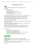
So first of all, how does the design of our website look. I think the website looks great, it contains a
few pictures, and it doesn’t have huge parts of text where they aren’t needed. The website is a web
shop, and there for the visitors are looking for products to buy. The products on the website contain
a description of the products, and it is easy to navigate through the website. So how can we see if the
users are satisfied with the design of the website? Well we can make an survey and send this to
people that subscribed to our newsletter. With this survey we can ask questions like: how do you find
shopping with us, and what could we improve to our website? We also asked a couple students what
their opinion is about the website: results where that they thought it looked professional and clear.
They also thought it was a nice touch that they are able to subscribe to our website. We can also see
if users are satisfied with the website with the amount of sales. When we sell a lot of products it is
likely that the visitors like the
website, and find it easy to
use. We can also analyse the
statistics of the website, here
we can see how many
minutes people spend on the
website before buying
something. What we can see
with this is if people find it
easy or hard to navigate
through the website.
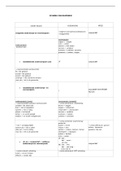
Usability feature/ visual appeal Assessed on our website
How does the website use white space? I think we used the white space very well. There
aren’t use chunks of text which might bore the
visitor. We do have small sections on our
homepage where there is a small bit of white
space, this will give the visitor a sort of peace
while visiting our website.
Is the website appealing to the target group? The website is very appealing to the target
group. It is because the ‘sale’ is the first thing
you see on the website, and this appeals to
everyone. Another reason why the website is
appealing to the target group is because it is
easy to use, and people always want to use the
easiest way to buy something for example, and
that will be our website .
also draw a plan to assess the design of our website, so does the website look good and does it
provide the users with satisfactions. Finally I will discuss the visual appeal and usability features ( five
in total).
So first of all, how does the design of our website look. I think the website looks great, it contains a
few pictures, and it doesn’t have huge parts of text where they aren’t needed. The website is a web
shop, and there for the visitors are looking for products to buy. The products on the website contain
a description of the products, and it is easy to navigate through the website. So how can we see if the
users are satisfied with the design of the website? Well we can make an survey and send this to
people that subscribed to our newsletter. With this survey we can ask questions like: how do you find
shopping with us, and what could we improve to our website? We also asked a couple students what
their opinion is about the website: results where that they thought it looked professional and clear.
They also thought it was a nice touch that they are able to subscribe to our website. We can also see
if users are satisfied with the website with the amount of sales. When we sell a lot of products it is
likely that the visitors like the
website, and find it easy to
use. We can also analyse the
statistics of the website, here
we can see how many
minutes people spend on the
website before buying
something. What we can see
with this is if people find it
easy or hard to navigate
through the website.
Usability feature/ visual appeal Assessed on our website
How does the website use white space? I think we used the white space very well. There
aren’t use chunks of text which might bore the
visitor. We do have small sections on our
homepage where there is a small bit of white
space, this will give the visitor a sort of peace
while visiting our website.
Is the website appealing to the target group? The website is very appealing to the target
group. It is because the ‘sale’ is the first thing
you see on the website, and this appeals to
everyone. Another reason why the website is
appealing to the target group is because it is
easy to use, and people always want to use the
easiest way to buy something for example, and
that will be our website .