Flexbox Guías de estudio, Notas de estudios & Resúmenes
¿Buscas las mejores guías de estudio, notas de estudio y resúmenes para Flexbox? En esta página encontrarás 14 documentos de estudio para Flexbox.
All 14 resultados
Ordenador por
-
CSS Exam Questions and Answers Graded A 2024
- Examen • 4 páginas • 2024
- 10,87 €
- + aprende más y mejor
Which of the following is NOT a valid pseudo-class? - :test What is the right way to select every 4th paragraph? - p:nth-of-type(4n) Which of the following are true about Flexible Box? - 2. Flexbox consists of flex containers and flex items. 1. Inside a flex container there is one or more flex items. Which of the following are valid multi-column properties? - ALL OF THESE ARE CORRECT 1. Column-count 2. Column-gap 3. Column-rule-style 4. Column-rule-width Which of the following i...
-
CSS EXAM QUESTIONS AND ANSWERS
- Examen • 4 páginas • 2023
- 9,92 €
- + aprende más y mejor
Which of the following is NOT a valid pseudo-class? - Answer- :test What is the right way to select every 4th paragraph? - Answer- p:nth-of-type(4n) Which of the following are true about Flexible Box? - Answer- 2. Flexbox consists of flex containers and flex items. 1. Inside a flex container there is one or more flex items. Which of the following are valid multi-column properties? - Answer- ALL OF THESE ARE CORRECT 1. Column-count 2. Column-gap 3. Column-rule-style 4. Column-rule-w...
-
Here is a suggested title: "Mastering CSS Flexbox: A Student's Guide with Examples for Learning Flexible Box Layouts to Prepare for Exams"
- Notas de lectura • 5 páginas • 2023
- 9,92 €
- + aprende más y mejor
Certainly! Let's create a simple example of using Flexbox in CSS for a student class notes section, focusing on key elements. Flexbox is great for creating flexible and responsive layouts. Here's a breakdown: HTML Structure: Use HTML to define the structure of your notes section. Key elements include a container for notes and individual note items. html Copy code <!DOCTYPE html> <html lang="en"> <head> <meta charset="UTF-8"> <meta name="viewp...
-
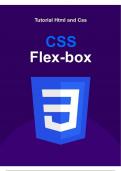
CSS: Flexbox, como y cuando utilizar (CSS Medio)
- Notas de lectura • 1 páginas • 2024
- 5,19 €
- + aprende más y mejor
Aprendemos a utilizar la propiedad flexbox para dar un estilado de nuestros bloques y lineas del sitio de una forma mas profesional utilizando todo el espacio disponible y dando responsive-design para cuando el usuario interactúe con este.
-
Css Flexbox Series
- Otro • 15 páginas • 2023
- 7,56 €
- + aprende más y mejor
You can use CSS flexbox for designing web page

¿Quieres que te pagan semanalmente? Pues es possible!

-
Some of my study notes for HTML and CSS (and flexbox)
- Otro • 3 páginas • 2023
- 9,49 €
- + aprende más y mejor
Just as the title says, some of my study notes for HTML and CSS (and Flexbox).
-
Layout and positioning with css theory
- Notas de lectura • 12 páginas • 2023
- 9,17 €
- + aprende más y mejor
The "Layout and Positioning with CSS Theory" course provides an in-depth exploration of the principles governing the arrangement and positioning of elements on webpages. Students delve into theoretical aspects of CSS layout techniques, including floats, flexbox, and grid. The curriculum covers positioning properties, responsive design considerations, and practical strategies for creating versatile and visually appealing page layouts. Through theoretical discussions and hands-on exercises, partic...
-
HTML Css
- Resumen • 39 páginas • 2024
- 9,45 €
- + aprende más y mejor
HTML5 and CSS are foundational technologies for web development, each serving distinct but complementary roles. ### HTML5 HTML5 is the latest version of the HyperText Markup Language, which is the standard language used to create web pages. It introduces several new features and improvements over previous versions, including: 1. **New Elements**: HTML5 adds new semantic elements like `<header>`, `<footer>`, `<article>`, `<section>`, and `<nav>`, which provide...
-
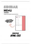
Here is a suggested title for a sidebar menu website frontend project with HTML, CSS, and source code: "Sleek Sidebar: Responsive Navigation Menu with HTML, CSS, JavaScript Source Code"
- Notas de lectura • 5 páginas • 2023
- 10,40 €
- + aprende más y mejor
Key Points: Container Flex Layout: The main container uses display: flex to create a flexbox layout. The container holds the sidebar and the main content. Sidebar Styling: The sidebar has a fixed width (width: 250px) and a background color of #333. Links inside the sidebar are styled with text-decoration: none and white color. Main Content Styling: The main content area (class="content") has a flexible width (flex-grow: 1) to fill the remaining space in the container. It has a b...
-
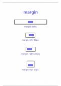
Here is a suggested title: "Exploring Icons and Margins: An Interactive Guide to Utilizing Icons and CSS Margins with Code Examples"
- Notas de lectura • 4 páginas • 2023
- 10,40 €
- + aprende más y mejor
Key Points: Font Awesome Icons: We use the <i> tag with the class fas fa-user-graduate to include a graduation cap icon from Font Awesome. Margin and Padding: The .student-card class has a margin of 20px to provide spacing around the card. Padding is applied for aesthetic reasons, and it has a border to define the card. Flexbox Layout: display: flex is used to create a flex container, allowing easy alignment of items. align-items: center centers the items vertically. Icon St...