Centre number Candidate number
Surname
Forename(s)
Candidate signature
I declare this is my own work.
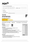
GCSE
STATISTICS
Foundation Tier Paper 1
F
2024_AQA-GCSE Statistics –
Foundation Tier Paper 1
(Merged Question Paper and Marking Scheme)
Wednesday 5 June 2024
Wednesday 5 June 2024 Afternoon Time allowed: 1 hour 45 minutes
Materials
For Examiner’s Use
For this paper you must have:
• a calculator Question Mark
• mathematical instruments.
1–4
Instructions 5
• Use black ink or black ball-point pen. Draw diagrams in pencil. 6
• Fill in the boxes at the top of this page.
7
• Answer all questions.
8
• You must answer the questions in the spaces provided. Do not write
outside the box around each page or on blank pages. 9
• If you need extra space for your answer(s), use the lined pages at the end of 10
this book. Write the question number against your answer(s).
• Do all rough work in this book. Cross out any work you do not want 11
to be marked. 12
13
Information
TOTAL
• The marks for questions are shown in brackets.
• The maximum mark for this paper is 80.
• You may ask for more answer paper and graph paper. These must be
tagged securely to this answer booklet.
,GCSE Statistics: Foundation Tier Paper 1 Summary
The GCSE Statistics Foundation Tier Paper 1, scheduled for June 2025, will assess students'
understanding of fundamental statistical concepts and their ability to apply them to real-world data. This
paper is designed to test a range of basic statistical techniques, focusing on data collection, presentation,
and interpretation, as well as an introduction to probability.
Key Areas Covered:
1. Data Collection
Understanding Data:
o Recognizing the difference between qualitative and quantitative data.
o Identifying discrete and continuous data.
Sampling Methods:
o Recognizing different sampling techniques such as random sampling, stratified
sampling, and systematic sampling.
o Understanding the importance of using representative samples and the potential impact of
biased sampling.
Survey Design:
o Designing simple surveys and questionnaires to collect data effectively.
2. Data Presentation
Tables and Charts:
o Organizing data in frequency tables and using bar charts for categorical data.
o Understanding and creating pie charts to represent proportional data.
o Drawing pictograms and bar graphs, and understanding when each is appropriate for
data presentation.
Histograms:
o Creating and interpreting histograms to represent continuous data, including understanding
how data is grouped into intervals.
Cumulative Frequency:
o Constructing cumulative frequency tables and using them to create cumulative frequency
graphs.
o Interpreting cumulative frequency graphs to identify the median, quartiles, and range.
3. Measures of Central Tendency and Spread
Central Tendency:
o Calculating the mean, median, and mode for different data sets, and knowing when to use
each measure based on the nature of the data.
Measures of Spread:
o Understanding and calculating the range of a dataset.
o Introduction to the concept of interquartile range (IQR) as a measure of spread.
4. Probability
Basic Probability:
o Understanding basic probability concepts and calculating simple probabilities, such as the
likelihood of events occurring.
o Using probability notation (e.g., P(A) for the probability of event A).
o Calculating the probability of a single event and the probability of multiple events
happening (independent and dependent events).
Probabilities of Events:
, o Using probability scale from 0 to 1 to represent the likelihood of events.
o Understanding and calculating the probability of complementary events (e.g., the
probability of not A).
Venn Diagrams:
o Interpreting and using Venn diagrams to solve problems involving probability, including
union and intersection of events.
5. Statistical Diagrams and Interpretation
Bar Charts and Line Graphs:
o Drawing and interpreting bar charts and line graphs.
o Understanding the importance of labeling axes and ensuring the scale is consistent.
Scatter Diagrams:
o Creating scatter diagrams and interpreting the relationship between two variables.
o Identifying the type of correlation (positive, negative, or none).
Box Plots:
o Introduction to box plots for representing the distribution of data and understanding key
features like the median, quartiles, and outliers.
6. Understanding of Data Distribution
Normal Distribution:
o Recognizing the bell-shaped curve of the normal distribution and understanding how it
can be used in real-world contexts.
Skewed Data:
o Understanding the concept of skewed data, where the data distribution is not symmetrical,
and how it affects measures of central tendency.
*JUN2483821F01*
IB/G/Jun24/G4004/E10 8382/1F
, 2
Do not write
outside the
Answer all questions in the spaces provided. box
1 Work out the range of these values.
3 6 6 6 8 9 11 15
Circle your answer below.
[1 mark]
6 7 8 12
2 Circle the percentage that cannot be a probability.
[1 mark]
0.01% 110% 10% 100%
3 Which of these is not a source of data?
Circle your answer.
[1 mark]
Observation Simulation Census Stratification
4 Spearman’s rank correlation coefficients are calculated for four data sets.
Which of these values represents a weak, negative correlation?
Circle your answer.
[1 mark]
4
–1 0.02 –0.9 –0.4
*02*
IB/G/Jun24/8382/1F


