
TEST 2, covering the theory of units 13, 24, 12, 15, 14, 16, 17,
18, 19, 23, 20, 22
Unit 13: Visualizing and analyzing bivariate relationships in R
Learning objectives
You are able to differentiate between bivariate and univariate graphs and tables (and you
know when to use what kind of display).
You can create a scatterplot (using statistical software and by hand) with the independent
variable on the X-axis and the dependent variable on the Y-axis.
You can create a contingency table (using statistical software and by hand) with the
independent variable in the columns, the dependent variables in the rows, and column
percentages in the cells.
You are able to interpret results that are displayed in scatterplots and contingency tables.
Information from Babbie / Video’s / PPT’s / Assignments
A bivariate relationship refers to the association or connection between two variables (X is causing
Y). In research methodology and statistics, analyzing bivariate relationships helps to understand how
two variables relate to each other and whether there is a significant association between them. The
analysis method depends on the type of variables involved and the nature of their relationship.
The main difference between univariate and bivariate graphs is the number of variables being
represented and analyzed:
1. Univariate Graphs
Definition: Focus on a single variable.
Purpose: Show the distribution, central tendency (like mean or median), and spread (like range or
variance) of just one variable.
Examples:
- Histogram: Displays the frequency of data points across intervals for one variable.
- Box Plot: Shows the median, quartiles, and possible outliers of one variable.
- Bar Chart: Often used for categorical data to show counts or proportions for different
categories.
- Example: A histogram of students’ test scores. This graph only describes one variable (test
scores) and how often each range of scores occurs.
2. Bivariate Graphs
Definition: Display the relationship between two variables.
Purpose: Examine if there’s an association, correlation, or other relationship between the two
variables.
Examples:
- Scatterplot: Shows the relationship between two continuous variables, helping visualize
correlation (positive, negative, or none).
- Line Graph: Can show changes in one variable relative to another, often used for time series
data.
- Side-by-Side Bar Chart: For two categorical variables, showing frequencies or proportions in
each category combination.
, - Example: A scatterplot of hours studied vs. test scores. This graph shows the relationship
between the two variables and can help determine if more hours studied leads to higher test
scores.
Types of bivariate relationships:
- Positive relationship: When one variable increases, the other also increases. For example,
height and weight often show a positive relationship, with taller people typically weighing
more.
- Negative relationship: When one variable increases, the other decreases. For example, the
hours a student works and their academic performance might show a negative relationship
in some contexts.
- No relationship: There’s no systematic pattern between the two variables.
Analysis techniques for bivariate relationships:
- Scatterplot: A graph that helps visualize the relationship between two variables. In a
scatterplot, points represent the values of the two variables, which can show the direction
and strength of their relationship.
- Contingency tables: For categorical variables, contingency tables show the association
between categories of two variables by displaying frequencies or percentages in a matrix.
- Correlation coefficient: A statistical measure that indicates the strength and direction of the
relationship between two continuous variables. The Pearson correlation coefficient is
commonly used for this, ranging from -1 (perfect negative relationship) to +1 (perfect
positive relationship). This gets explained further in unit 24.
Scatterplots
Contingency table is useful for nominal and ordinal variables, but not for quantitative variables
Scatterplot more appropriate for quantitative variables (instead of categories exact numbers)
(more precise)
Best way to display the relationship between the quantitative variables is with a scatterplot.
To make a scatterplot: We draw two lines (axis)
- Horizontal axis = X axis (independent variable)
- Vertical axis = Y axis (dependent variable)
- If there is no distinguishing between dependent and independent variable, the placement on
the y axis and x axis is a matter of choice
Contingency tables
A contingency table displays the relationship between two categorical (nominal or ordinal) variables,
showing how they distribute across different categories. Unlike a frequency table, which focuses on
one variable, a contingency table involves two variables, allowing for an analysis of their potential
relationship.
- Basic Structure: A contingency table alone doesn’t provide much information about the
correlation between variables since the row and column totals may vary.
- Insights with Percentages: Analyzing column percentages can offer more insight:
- Column Percentages: Calculated as (cell value / column total) x 100, these percentages help
in understanding the relative distribution within each column.
- Conditional Proportions: Represent percentages as proportions (e.g., 45% is written as 0.45).
These are conditional because their formation depends on another variable.
- Marginal Proportions: Calculated using row totals relative to the grand total, providing
overall proportions of each row category.
1
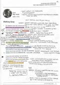
, Interpretation of a scatterplot
To interpret a scatterplot, analyze the overall pattern and look for departures like outliers. Key
aspects to examine include:
1. Direction
- Positive Relationship: When one variable increases, the other variable also tends to
increase. Think of it like height and weight—taller people often weigh more, so the
points on the scatterplot would trend upwards.
- Negative Relationship: When one variable increases, the other tends to decrease.
For example, the more time spent studying, the less likely someone is to get a low
grade. Here, the points would trend downwards.
2. Form
- Linear: The points form a straight line (or close to it). This means that as one variable
changes, the other changes at a steady rate. For instance, if you study a bit more,
your grades might improve consistently.
- Curvilinear: The points form a curve rather than a straight line. This means the
relationship isn’t steady; one variable might increase up to a certain point and then
start to decrease. For example, working memory might improve with age up to a
certain point, and then decline as people get older.
3. Strength
- Strong Relationship: The points are very close to the trend line (whether straight or
curved). This means a clear relationship between the two variables, like height and
weight in adults—taller people almost always weigh more.
- Weak Relationship: The points are more spread out, meaning the relationship
between the variables is less clear. For example, if you looked at the relationship
between hours of sleep and happiness, people who sleep a lot might be happier, but
the points might still be scattered.
2
18, 19, 23, 20, 22
Unit 13: Visualizing and analyzing bivariate relationships in R
Learning objectives
You are able to differentiate between bivariate and univariate graphs and tables (and you
know when to use what kind of display).
You can create a scatterplot (using statistical software and by hand) with the independent
variable on the X-axis and the dependent variable on the Y-axis.
You can create a contingency table (using statistical software and by hand) with the
independent variable in the columns, the dependent variables in the rows, and column
percentages in the cells.
You are able to interpret results that are displayed in scatterplots and contingency tables.
Information from Babbie / Video’s / PPT’s / Assignments
A bivariate relationship refers to the association or connection between two variables (X is causing
Y). In research methodology and statistics, analyzing bivariate relationships helps to understand how
two variables relate to each other and whether there is a significant association between them. The
analysis method depends on the type of variables involved and the nature of their relationship.
The main difference between univariate and bivariate graphs is the number of variables being
represented and analyzed:
1. Univariate Graphs
Definition: Focus on a single variable.
Purpose: Show the distribution, central tendency (like mean or median), and spread (like range or
variance) of just one variable.
Examples:
- Histogram: Displays the frequency of data points across intervals for one variable.
- Box Plot: Shows the median, quartiles, and possible outliers of one variable.
- Bar Chart: Often used for categorical data to show counts or proportions for different
categories.
- Example: A histogram of students’ test scores. This graph only describes one variable (test
scores) and how often each range of scores occurs.
2. Bivariate Graphs
Definition: Display the relationship between two variables.
Purpose: Examine if there’s an association, correlation, or other relationship between the two
variables.
Examples:
- Scatterplot: Shows the relationship between two continuous variables, helping visualize
correlation (positive, negative, or none).
- Line Graph: Can show changes in one variable relative to another, often used for time series
data.
- Side-by-Side Bar Chart: For two categorical variables, showing frequencies or proportions in
each category combination.
, - Example: A scatterplot of hours studied vs. test scores. This graph shows the relationship
between the two variables and can help determine if more hours studied leads to higher test
scores.
Types of bivariate relationships:
- Positive relationship: When one variable increases, the other also increases. For example,
height and weight often show a positive relationship, with taller people typically weighing
more.
- Negative relationship: When one variable increases, the other decreases. For example, the
hours a student works and their academic performance might show a negative relationship
in some contexts.
- No relationship: There’s no systematic pattern between the two variables.
Analysis techniques for bivariate relationships:
- Scatterplot: A graph that helps visualize the relationship between two variables. In a
scatterplot, points represent the values of the two variables, which can show the direction
and strength of their relationship.
- Contingency tables: For categorical variables, contingency tables show the association
between categories of two variables by displaying frequencies or percentages in a matrix.
- Correlation coefficient: A statistical measure that indicates the strength and direction of the
relationship between two continuous variables. The Pearson correlation coefficient is
commonly used for this, ranging from -1 (perfect negative relationship) to +1 (perfect
positive relationship). This gets explained further in unit 24.
Scatterplots
Contingency table is useful for nominal and ordinal variables, but not for quantitative variables
Scatterplot more appropriate for quantitative variables (instead of categories exact numbers)
(more precise)
Best way to display the relationship between the quantitative variables is with a scatterplot.
To make a scatterplot: We draw two lines (axis)
- Horizontal axis = X axis (independent variable)
- Vertical axis = Y axis (dependent variable)
- If there is no distinguishing between dependent and independent variable, the placement on
the y axis and x axis is a matter of choice
Contingency tables
A contingency table displays the relationship between two categorical (nominal or ordinal) variables,
showing how they distribute across different categories. Unlike a frequency table, which focuses on
one variable, a contingency table involves two variables, allowing for an analysis of their potential
relationship.
- Basic Structure: A contingency table alone doesn’t provide much information about the
correlation between variables since the row and column totals may vary.
- Insights with Percentages: Analyzing column percentages can offer more insight:
- Column Percentages: Calculated as (cell value / column total) x 100, these percentages help
in understanding the relative distribution within each column.
- Conditional Proportions: Represent percentages as proportions (e.g., 45% is written as 0.45).
These are conditional because their formation depends on another variable.
- Marginal Proportions: Calculated using row totals relative to the grand total, providing
overall proportions of each row category.
1
, Interpretation of a scatterplot
To interpret a scatterplot, analyze the overall pattern and look for departures like outliers. Key
aspects to examine include:
1. Direction
- Positive Relationship: When one variable increases, the other variable also tends to
increase. Think of it like height and weight—taller people often weigh more, so the
points on the scatterplot would trend upwards.
- Negative Relationship: When one variable increases, the other tends to decrease.
For example, the more time spent studying, the less likely someone is to get a low
grade. Here, the points would trend downwards.
2. Form
- Linear: The points form a straight line (or close to it). This means that as one variable
changes, the other changes at a steady rate. For instance, if you study a bit more,
your grades might improve consistently.
- Curvilinear: The points form a curve rather than a straight line. This means the
relationship isn’t steady; one variable might increase up to a certain point and then
start to decrease. For example, working memory might improve with age up to a
certain point, and then decline as people get older.
3. Strength
- Strong Relationship: The points are very close to the trend line (whether straight or
curved). This means a clear relationship between the two variables, like height and
weight in adults—taller people almost always weigh more.
- Weak Relationship: The points are more spread out, meaning the relationship
between the variables is less clear. For example, if you looked at the relationship
between hours of sleep and happiness, people who sleep a lot might be happier, but
the points might still be scattered.
2