Here is a suggested title: "Mastering CSS Flexbox: A Student's Guide with Examples for Learning Flexible Box Layouts to Prepare for Exams"
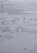
Certainly! Let's create a simple example of using Flexbox in CSS for a student class notes section, focusing on key elements. Flexbox is great for creating flexible and responsive layouts. Here's a breakdown: HTML Structure: Use HTML to define the structure of your notes section. Key elements include a container for notes and individual note items. html Copy code <!DOCTYPE html> <html lang="en"> <head> <meta charset="UTF-8"> <meta name="viewport" content="width=device-width, initial-scale=1.0"> <link rel="stylesheet" href=""> <title>Student Class Notes</title> </head> <body> <div class="notes-container"> <div class="note">Note 1</div> <div class="note">Note 2</div> <div class="note">Note 3</div> </div> </body> </html> CSS Styling with Flexbox: Apply Flexbox properties to create a horizontal or vertical layout for the notes. Key styles include setting display to flex, adjusting flex properties, and styling individual notes. css Copy code body { font-family: 'Arial', sans-serif; margin: 0; padding: 0; } .notes-container { display: flex; justify-content: space-around; /* Adjust based on your preference */ align-items: center; height: 100vh; /* Set the height to fill the viewport */ } .note { flex: 1; /* Each note takes equal space */ padding: 20px; margin: 10px; border: 1px solid #ddd; border-radius: 8px; background-color: #f9f9f9; text-align: center; } In this example: The .notes-container is set to display: flex, making its children (.note elements) flex items. justify-content: space-around; evenly distributes the notes horizontally, and you can adjust it based on your preference. align-items: center; centers the notes vertically. Each .note has a flexible width (flex: 1;), ensuring they take equal space within the container
Geschreven voor
- Vak
- COMPUTER
Documentinformatie
- Geüpload op
- 15 december 2023
- Aantal pagina's
- 5
- Geschreven in
- 2023/2024
- Type
- College aantekeningen
- Docent(en)
- Dr. felipe torres
- Bevat
- Alle colleges
Onderwerpen
-
css for responsive websi
-
html tutorial for beginners
-
javascript project for college students
-
html and css tutorial for beginners
-
web development for beginnerscss flex box
-
css tutorials for beginners
Ook beschikbaar in voordeelbundel