Summary html
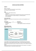
Responsive design: using HTML and CSS to create web pages that adapt to different screen sizes and devices. Responsive design is an approach to web design that uses HTML and CSS to create web pages that adapt to different screen sizes and devices. The goal of responsive design is to provide a consistent user experience across all devices, from desktop computers to smartphones and tablets. To create a responsive design, web developers use a combination of HTML and CSS to adjust the layout and content of a web page based on the size and orientation of the screen. Some key techniques used in responsive design include: Flexible grid systems: Web developers use flexible grid systems, such as Bootstrap or CSS Grid, to create layouts that can adjust to different screen sizes. These grid systems allow developers to specify the number of columns and the size of each column based on the screen width. Media queries: Media queries are used to apply different styles to a web page based on the size of the screen. By using media queries, developers can specify different styles for desktop computers, tablets, and smartphones. Responsive images: Web developers use responsive images to ensure that images are displayed at the appropriate size for the device. This helps to minimize the amount of data that needs to be downloaded, which can improve page load times on mobile devices. Fluid typography: Web developers use fluid typography to adjust the size of text based on the size of the screen. This helps to ensure that text is legible on all devices, regardless of screen size. By using these techniques and others, web developers can create responsive designs that adapt to different screen sizes and devices. This helps to ensure that users have a consistent and enjoyable experience, regardless of the device they are using to access the web page.
Geschreven voor
- Instelling
- Onbekend
- Vak
- Software Engineering
Documentinformatie
- Geüpload op
- 26 maart 2023
- Aantal pagina's
- 14
- Geschreven in
- 2022/2023
- Type
- SAMENVATTING
Onderwerpen
-
htmlforbeginnners