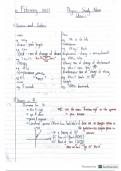
Composition and layout - CORRECT ANSWERS-Composition is the arrangement of
design elements that form a whole image. A successful composition attracts the viewer
and guides their eye across the design. In visual art, you might hear this referred to as
"form." In graphic design, it's often called layout. Composition is made up of a number of
different visual design elements, including balance, proximity, alignment, repetition,
contrast and white space.
Balance - CORRECT ANSWERS-This isn't your ability to walk a straight line after three
beers. In design, balance involves the placement of elements on the page so that the
text and graphic elements are evenly distributed. There are three ways to achieve
balance: symmetrically, asymmetrically and radially.
Symetrical - CORRECT ANSWERS-Symmetry is achieved when all design elements
are equal on both sides of a central line
Asymmetrical - CORRECT ANSWERS-When graphics and text are not equal on both
sides of a central line, a design is said to be asymmetrical. In the example above, there
is still balance, but there are graphics on one side and text on the other
Radial - CORRECT ANSWERS-When graphics and text are not equal on both sides of
a central line, a design is said to be asymmetrical. In the example above, there is still
balance, but there are graphics on one side and text on the other
Proximity - CORRECT ANSWERS-The way in which design elements are grouped or
spaced on a page is called proximity. Great design groups like elements together.
Alignment - CORRECT ANSWERS-Alignment is the position of text or graphics,
whether left, right, centered or full justified..
Repitition - CORRECT ANSWERS-To maintain a unified look, designers repeat
elements throughout a design. (Repetition is also defined as the number of times your
toddler asks for a cookie.)
Contrast - CORRECT ANSWERS-Contrast is achieved by including elements within the
design that look measurably different from one another. A designer may use color,
shape, texture, size or typeface to create contrast.
White Space - CORRECT ANSWERS-White space—sometimes called negative
space—is the part of the design that is unmarked by imagery or text. It's also what
Midwesterners call their depressing, winter landscape.
1|Page
, Rule of Thirds - CORRECT ANSWERS-The rule of thirds is a technique that designers
use to determine focal point. Using a grid of three rows and columns, focal points are
indicated where the lines converge. Designers use this as a guide to determine where
to place important elements in their design.
Grid - CORRECT ANSWERS-A grid is a series of intersecting vertical, horizontal,
angular or curved lines used to organize graphic elements on a page, as well as in
relation to one another.
Hierarchy - CORRECT ANSWERS-In design, hierarchy is the organization of elements
by level of importance. Newspapers, magazine spreads and movie posters are good
examples of the use of design hierarchy. Headlines (also called display type) are
usually placed at the top, while subheads and body copy fall underneath
Scale - CORRECT ANSWERS-Scale is the size of an object in relation to another
object (not that thing in your bathroom that you curse at each morning). Scale can be
used to create interest and grab a viewer's attention.
Thumbnail Sketch - CORRECT ANSWERS-When conceptualizing, a designer will often
create small, rough drawings—thumbnail sketches—to explore many ideas.
Mock-Up - CORRECT ANSWERS-A mock-up is a real or digital model used to test
early design ideas and see how they could look in the real world.
Resoloution - CORRECT ANSWERS-The detail of an image based on the number of
pixels is known as resolution. An image looks clearer when it has a higher resolution.
DPI - CORRECT ANSWERS-DPI stands for "dots per inch," which is a measure of a
printer's quality. For high-quality printing, 300dpi is recommended. For example, a
300dpi image at 1200×1800 pixels will become as a 4×6 inch print.
PPI - CORRECT ANSWERS-PPI stands for "pixels per inch," which is a measure of
pixel density used by electronic image devices. You'll likely see this used with scanners,
cameras, TVs or monitors. Learn more about the difference between DPI and PPI.
Bleed - CORRECT ANSWERS-Sounds pretty gruesome, but bleed is when a design
actually extends past its printed edge so there's no chance of white borders when it's
trimmed down after printing.
Trim - CORRECT ANSWERS-Trim size is the final size of a printed piece after it has
been trimmed from its page. Trimming is executed along crop marks that show where to
cut.
Pixels - CORRECT ANSWERS-Trim size is the final size of a printed piece after it has
been trimmed from its page. Trimming is executed along crop marks that show where to
cut.
2|Page