

Core – Data Analysis
Types of data:
Categorical data:
Represent characteristics or qualities.
Nominal: categories that are named for each of the possible responses/grouped according
to a particular characteristic.
E.g. types of pets, house number, postcode, eye colour
Ordinal: Categories that are named with some notion of order/ ordered according to a
particular characteristic.
E.g. Bank account numbers, quality of work, year level, car size (small, medium, large)
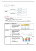
Categorical data can be displayed using:
Frequency tables Frequency can be recorded as a
number (the number of a times
a value occurs) or percentages
(the percentage of times a
value occurs)
Bar chart/ Length/height of each bar
column graph represents frequency, relative
frequency or percentage
frequency.
The bars are equally spaced
and are not joined together.
Can be drawn with horizontal
bars.
Segmented bar A single bar divided into Title
Label
chart segments so that the length of
each segment is proportional
to the frequency.
Can also be made using
percentages
Always include a key
Label
, Mode/ modal Most frequently occurring
category value or category
Only of interest when a single
category stands out from the
rest
Not affected by outliers or
skewedness
Writing a report describing the distribution of categorical variables:
Briefly summarise the context in which the data was collected including the total
number of the sample
If there is a clear mode/model category, ensure it is always mentioned
Include percentages or frequencies in a report (percentages are preferred)
If there is a lot of categories, it is not necessary to mention every category, but the modal
category should always be mentioned.
Numerical data:
Represent quantities/ Data is recorded and classified in numerical form.
Discrete: Data that can only take particular values/ quantities that are counted.
E.g. Date of birth, the number of pages in a book, age in years, number of people in a bus
Continuous: Data that can take any value/ quantities that are measured.
E.g. Distance from home to school, Height of a person, the air temperature in degrees
Celsius
Numerical data can be displayed using:
Frequency table If the data is numerical
discrete, it is organized by
numerical values.
If the data is numerical
continuous, it is organized into
intervals.
Histogram The bars are joined together
but empty classes have bars of
0.
For discrete data, each bar
starts and ends halfway
between values.
For continuous data, each bar
corresponds to a data interval.
* // used on the horizontal axis
indicate the numbers on this axis
have not started at 0*
* If histogram is in intervals, give
answers in intervals as well *
Dot plot Mostly used to display discrete
numerical data,
From a dot plot identify:
, Shape
Median, mode, mean
IQR, range
Outliers
Stem and leaf Stem holds the group value and
plots numbers can not be skipped
Leaf holds the final digit only
Stem and leaf plot must include:
Title
Key/ legend
Columns must be labeled
When using split stems, the first
section is denoted by the number
and the next section is denoted by
the number and an asterix (*).
Left side: read shape as normal
Right side: read the shape as the
opposite if the shape you normally
see
Box plot A box plot is a graphical display of
the five-figure summary:
Minimum
Q1 (lower quartile)
Median (M)
Q3 (upper quartile)
Maximum
A box plot must included:
A uniform number scale
Box plots are clearly labeled
Outliers are marked
Each section contains the same
number
of data (25%) as they are quartiles
Types of data:
Categorical data:
Represent characteristics or qualities.
Nominal: categories that are named for each of the possible responses/grouped according
to a particular characteristic.
E.g. types of pets, house number, postcode, eye colour
Ordinal: Categories that are named with some notion of order/ ordered according to a
particular characteristic.
E.g. Bank account numbers, quality of work, year level, car size (small, medium, large)
Categorical data can be displayed using:
Frequency tables Frequency can be recorded as a
number (the number of a times
a value occurs) or percentages
(the percentage of times a
value occurs)
Bar chart/ Length/height of each bar
column graph represents frequency, relative
frequency or percentage
frequency.
The bars are equally spaced
and are not joined together.
Can be drawn with horizontal
bars.
Segmented bar A single bar divided into Title
Label
chart segments so that the length of
each segment is proportional
to the frequency.
Can also be made using
percentages
Always include a key
Label
, Mode/ modal Most frequently occurring
category value or category
Only of interest when a single
category stands out from the
rest
Not affected by outliers or
skewedness
Writing a report describing the distribution of categorical variables:
Briefly summarise the context in which the data was collected including the total
number of the sample
If there is a clear mode/model category, ensure it is always mentioned
Include percentages or frequencies in a report (percentages are preferred)
If there is a lot of categories, it is not necessary to mention every category, but the modal
category should always be mentioned.
Numerical data:
Represent quantities/ Data is recorded and classified in numerical form.
Discrete: Data that can only take particular values/ quantities that are counted.
E.g. Date of birth, the number of pages in a book, age in years, number of people in a bus
Continuous: Data that can take any value/ quantities that are measured.
E.g. Distance from home to school, Height of a person, the air temperature in degrees
Celsius
Numerical data can be displayed using:
Frequency table If the data is numerical
discrete, it is organized by
numerical values.
If the data is numerical
continuous, it is organized into
intervals.
Histogram The bars are joined together
but empty classes have bars of
0.
For discrete data, each bar
starts and ends halfway
between values.
For continuous data, each bar
corresponds to a data interval.
* // used on the horizontal axis
indicate the numbers on this axis
have not started at 0*
* If histogram is in intervals, give
answers in intervals as well *
Dot plot Mostly used to display discrete
numerical data,
From a dot plot identify:
, Shape
Median, mode, mean
IQR, range
Outliers
Stem and leaf Stem holds the group value and
plots numbers can not be skipped
Leaf holds the final digit only
Stem and leaf plot must include:
Title
Key/ legend
Columns must be labeled
When using split stems, the first
section is denoted by the number
and the next section is denoted by
the number and an asterix (*).
Left side: read shape as normal
Right side: read the shape as the
opposite if the shape you normally
see
Box plot A box plot is a graphical display of
the five-figure summary:
Minimum
Q1 (lower quartile)
Median (M)
Q3 (upper quartile)
Maximum
A box plot must included:
A uniform number scale
Box plots are clearly labeled
Outliers are marked
Each section contains the same
number
of data (25%) as they are quartiles

