Summary data analytics for engineers
EDA exploratory data analysis
What is data?
- We will say data referring to raw, unorganized numbers, facts etc. and use the word
information for structured, meaningful and useful numbers and facts
Data forms / types
- Numerical data
o continuous data – data that can attain any value on a given measurement
scale
▪ interval data - continuous data for which only differences have
meaning, no fixed “zero point”. (temperature / pH)
▪ ratio – continuous data for which ratio makes sense, has fixed “zero
point”, so ratios also doe make sense (budget for a movie)
o discrete data – data that can only attain certain values (integers)
- categorical data
o data that has no intrinsic numerical value
▪ nominal: two or more outcomes that have no natural order. (movie
genre, hair color)
▪ ordinal: two or more outcome that have a natural order. (movie rating)
Tables
- tables are good
o for reading off values
o to draw attention to actual values
- reference table; store “all” data in a table so that it can be
looked up easily
- demonstration table: table to illustrate a point (so present just
enough data)
turkey promoted to use graphs to explore data before using more advanced
key feature of EDA:
- getting to know the data before doing further analysis
- extensively using graphs
- generating questions
- detecting errors in data
what do we expect
- asking what to expect is also an important way to spot errors
- what are reasonable values?
- Given one value, what could be the others?
Dot plots/strip plots
- Good for showing actual values and structure of
numerical variables
- Not suitable for large data sets
- The jitter option may help avoid overlapping dots
,Histogram: distribution of numerical data
- The range of data values is split in bins (intervals of values)
o You can shoose the number of bins
o Choose the bin width you would like to have
- The histogram show the number of observations in the data
set for every bin
- Histogram are sensitive to bin width
o Bin width too small → too wiggly
o Bin width too large → too few details
- Rule of thumb for choosing sensible number of bins = √𝑛
Cumulative histogram
- A cumulative histogram shows count of percentages of the current
bin together with the counts or percentages of all binds to the left
of that bin
- We read of here that approximately 97% of the movies have a
budget not exceeding 100 million dollar
- Useful to illustrate thresholds
Bar charts and histograms
- Bar charts are for categorical data, histograms are for numerical data
Scatter plot
- Scatter plot allow to investigate relations
- Here we can see that a higher budget typically means a
higher profit
- For movies with a smaller budget, there is a lot of uncertainty
Location summary statistics
- Plots help us to explore and give clues
- Numerical summaries like average help us to document essential features of data
sets
- One should use both plots and numerical summaries, they complement each other
- Numerical summaries are often called statistics
Summary statistics
- There are different types of summary statistics
o Level: location summary statistics → what are “typical” values
o Spread: scale summary statistics → how much do values vary?
o Relation: association summary statistics → how do values of different
quantities vary simultaneously
Location summary statistics
- Mean (average) :
- Median :middle number
o Odd of observations: middle value when ordered from small to large
o Even of observations: average of two middle values when order from small to
large
- Mode: most frequently occurring value, may be non-unique
- Mean is sensitive for outliers, the median is not
- Mean can be misleading / difficult to interpret for non-symmetric distributions
,Quartiles
- Re-order the data from small to large
- 1st quartile = cut off point for 25% of the data
- 2nd quartile = cut off point for 50% of the data = median
- 3rd quartile = cut off point for 75% of the data
Location statistics : percentiles
- P percentile – a cut-off pint for p% of data
- We define the 0th percentile to be the minimal element of the dataset
- And the 100th percentile to be the maximal element of it
- For a dataset with n observations, the 2nd smallest observation will be at 100 / (n – 1)
percentile
Computing percentiles
- For a percentile P we compute its location in a data set of n observations:
𝑃
o 𝐿𝑝 = 1 + (𝑛 − 1)
100
- Computing P percentile value by linear interpolation
- Example:
Scale statistics
- Range = max – min
- Interquartile range (IQR) = 3rd quartile – 1st quartile
- Sample variance =
-
- Sample standard deviation
-
- Median absolute deviation (MAD) = median of the absolute deviation from the
median
- The higher these statistics, the more spread / variability in the data
Remarks about scale summary statistics
- The standard deviation has right unit
- The variance is more convenient mathematically
- The range, variance and standard deviation are sensitive to “outliers”, IQR and MAD
are not
- The standard deviation can be used as a general unit to describe variability
Standardardization (z-score normalization)
- Z-score transforms data in their original units into universal statistical
unit of standard deviation from the mean
- The mean value of the transformed data set is 0 and the standard deviation is 1
- Negative z-score → the value below the mean
- Positive z-score → value above the mean
- Rule of thumb: observations with a z-score larger
than 2.5 are considered to be extreme (“outliers”)
, Association statistics
- Association statistics try to capture in a number how strong the relation between two
quantities is
- The sign of a association statistics indicate whether it is
o A positive association (higher → higher)
o A negative association (higher → less)
Sample correlation
- Sample covariance:
- Sample correlation:
- “No” relation: Rxy close to 0
- “perfect” relation: Rxy close to -1 (negative correlation) or 1 (positive correlation)
Summary statistics and data types (nominal, ordinal, interval, ratio)
Advanced statistical plots
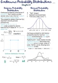
Typical distribution shapes
- unimodal distribution (1 peak)
- bimodal distribution (2 peaks, not necessarily the same),
possible due to 2 different groups that depending on the
context should not be combined
- symmetric distribution: there is no precise definition of
symmetry
- right-skewed distribution (also knows als positive skewed
because long tail on the right) asymmetry may indicate
“extreme” values. = positive skewed
o Mean > median and median closer to first quartile
Assessing the shape
- The fixed bins and choice of bin locations make it difficult to
accurately asses the shape of a data set
- This can be overcome to let the bin move along with the
data (gliding histogram)
- A more advanced way is to use a kernel function. The
gliding histogram corresponds to the uniform case, giving
equal weight to all the data points within the bin
EDA exploratory data analysis
What is data?
- We will say data referring to raw, unorganized numbers, facts etc. and use the word
information for structured, meaningful and useful numbers and facts
Data forms / types
- Numerical data
o continuous data – data that can attain any value on a given measurement
scale
▪ interval data - continuous data for which only differences have
meaning, no fixed “zero point”. (temperature / pH)
▪ ratio – continuous data for which ratio makes sense, has fixed “zero
point”, so ratios also doe make sense (budget for a movie)
o discrete data – data that can only attain certain values (integers)
- categorical data
o data that has no intrinsic numerical value
▪ nominal: two or more outcomes that have no natural order. (movie
genre, hair color)
▪ ordinal: two or more outcome that have a natural order. (movie rating)
Tables
- tables are good
o for reading off values
o to draw attention to actual values
- reference table; store “all” data in a table so that it can be
looked up easily
- demonstration table: table to illustrate a point (so present just
enough data)
turkey promoted to use graphs to explore data before using more advanced
key feature of EDA:
- getting to know the data before doing further analysis
- extensively using graphs
- generating questions
- detecting errors in data
what do we expect
- asking what to expect is also an important way to spot errors
- what are reasonable values?
- Given one value, what could be the others?
Dot plots/strip plots
- Good for showing actual values and structure of
numerical variables
- Not suitable for large data sets
- The jitter option may help avoid overlapping dots
,Histogram: distribution of numerical data
- The range of data values is split in bins (intervals of values)
o You can shoose the number of bins
o Choose the bin width you would like to have
- The histogram show the number of observations in the data
set for every bin
- Histogram are sensitive to bin width
o Bin width too small → too wiggly
o Bin width too large → too few details
- Rule of thumb for choosing sensible number of bins = √𝑛
Cumulative histogram
- A cumulative histogram shows count of percentages of the current
bin together with the counts or percentages of all binds to the left
of that bin
- We read of here that approximately 97% of the movies have a
budget not exceeding 100 million dollar
- Useful to illustrate thresholds
Bar charts and histograms
- Bar charts are for categorical data, histograms are for numerical data
Scatter plot
- Scatter plot allow to investigate relations
- Here we can see that a higher budget typically means a
higher profit
- For movies with a smaller budget, there is a lot of uncertainty
Location summary statistics
- Plots help us to explore and give clues
- Numerical summaries like average help us to document essential features of data
sets
- One should use both plots and numerical summaries, they complement each other
- Numerical summaries are often called statistics
Summary statistics
- There are different types of summary statistics
o Level: location summary statistics → what are “typical” values
o Spread: scale summary statistics → how much do values vary?
o Relation: association summary statistics → how do values of different
quantities vary simultaneously
Location summary statistics
- Mean (average) :
- Median :middle number
o Odd of observations: middle value when ordered from small to large
o Even of observations: average of two middle values when order from small to
large
- Mode: most frequently occurring value, may be non-unique
- Mean is sensitive for outliers, the median is not
- Mean can be misleading / difficult to interpret for non-symmetric distributions
,Quartiles
- Re-order the data from small to large
- 1st quartile = cut off point for 25% of the data
- 2nd quartile = cut off point for 50% of the data = median
- 3rd quartile = cut off point for 75% of the data
Location statistics : percentiles
- P percentile – a cut-off pint for p% of data
- We define the 0th percentile to be the minimal element of the dataset
- And the 100th percentile to be the maximal element of it
- For a dataset with n observations, the 2nd smallest observation will be at 100 / (n – 1)
percentile
Computing percentiles
- For a percentile P we compute its location in a data set of n observations:
𝑃
o 𝐿𝑝 = 1 + (𝑛 − 1)
100
- Computing P percentile value by linear interpolation
- Example:
Scale statistics
- Range = max – min
- Interquartile range (IQR) = 3rd quartile – 1st quartile
- Sample variance =
-
- Sample standard deviation
-
- Median absolute deviation (MAD) = median of the absolute deviation from the
median
- The higher these statistics, the more spread / variability in the data
Remarks about scale summary statistics
- The standard deviation has right unit
- The variance is more convenient mathematically
- The range, variance and standard deviation are sensitive to “outliers”, IQR and MAD
are not
- The standard deviation can be used as a general unit to describe variability
Standardardization (z-score normalization)
- Z-score transforms data in their original units into universal statistical
unit of standard deviation from the mean
- The mean value of the transformed data set is 0 and the standard deviation is 1
- Negative z-score → the value below the mean
- Positive z-score → value above the mean
- Rule of thumb: observations with a z-score larger
than 2.5 are considered to be extreme (“outliers”)
, Association statistics
- Association statistics try to capture in a number how strong the relation between two
quantities is
- The sign of a association statistics indicate whether it is
o A positive association (higher → higher)
o A negative association (higher → less)
Sample correlation
- Sample covariance:
- Sample correlation:
- “No” relation: Rxy close to 0
- “perfect” relation: Rxy close to -1 (negative correlation) or 1 (positive correlation)
Summary statistics and data types (nominal, ordinal, interval, ratio)
Advanced statistical plots
Typical distribution shapes
- unimodal distribution (1 peak)
- bimodal distribution (2 peaks, not necessarily the same),
possible due to 2 different groups that depending on the
context should not be combined
- symmetric distribution: there is no precise definition of
symmetry
- right-skewed distribution (also knows als positive skewed
because long tail on the right) asymmetry may indicate
“extreme” values. = positive skewed
o Mean > median and median closer to first quartile
Assessing the shape
- The fixed bins and choice of bin locations make it difficult to
accurately asses the shape of a data set
- This can be overcome to let the bin move along with the
data (gliding histogram)
- A more advanced way is to use a kernel function. The
gliding histogram corresponds to the uniform case, giving
equal weight to all the data points within the bin