

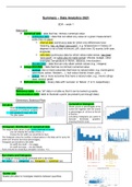
Summary – Data Analytics 2021
EDA – week 1
Data types
❖ numerical data - data that has intrinsic numerical value
o continuous data – data that can attain any value on a given measurement
scale (has no gaps)
▪ interval data (continuous data for which only differences have
meaning, has no fixed “zero point”,, e.g. temperature in Celsius (0
degrees is not a fixed minimum), pH, clock time, IQ scores, birth year,
longitude)
▪ ratio data (continuous data for which ratios make sense, has fixed
“zero point”, so ratios also do make sense) Movies: budget. Other
examples: temperature in Kelvin, distance, time duration.
o discrete data – data that can only attain certain values (e.g., integers)
❖ categorical data – data that has no intrinsic numerical value
o nominal: two or more outcomes that have no natural order, e.g. movie genre
(adventure, action, Western,…), hair colour (blond, brown, grey, ….)
o ordinal: two or more outcomes that have a natural order, e.g., movie ratings
(bad, neutral, good)
❖ Dichotomous data – binary data with ‘success’ or ‘failure’ (1 or 0, respectively)
Tables
Reference table: store “all” data in a table so that it can be looked up easily
Demonstration table: table to illustrate a point (so present just enough data)
Elementary Statistical Plots
Dot plots Cumulative histogram
Shows counts or percentages of the
- Good for showing actual values and
current bin together with the counts
structure of numerical variables
or percentages of all bins to the left
- Not suitable for large data sets
of that bin.
- The jitter option
cumulative histograms are useful to
illustrate thresholds (problem:
choosing fixed bin size)
Histogram: distribution of numerical data
The range of data values is split in bins (intervals of values)
- you can choose the number of bins, or
- choose the bin width you would like to have
The histogram show the number of observations in the data set for every bin
(there are versions that show percentages).
Histogram are sensitive to bin width
- bin width too small → too wiggly
- bin width too large → too few details
Rule of thumb for choosing a sensible nr of bins: ≈√𝑛
Bar charts and histogram
A histogram should not be confused with a bar chart .
Bar charts are for categorical data, histograms for numerical data.
Scatter plot
Scatter plot allow to investigate relations between quantities.
,Summary Statistics (summary statistics are convenient ways to summarize data in a numerical form)
❖ level: location summary statistics → what are “typical” values
❖ spread: scale summary statistics → how much do values vary?
❖ relation: association summary statistics → how do values of different quantities vary
simultaneously
Location summary statistics (location statistics are good to describe “typical” values)
(it is not sufficient to only use location summary statistics)
1 𝑛
- mean (average): ∑ 𝑥, denoted by 𝑥̅
𝑛 𝑖=1 𝑖
- median:
o odd # of observations: middle value when ordered from small to large
o even # of observations: or average of two middle values when order from
small to large
- mode: most frequently occurring value, may be non-unique
Mean is sensitive to “outliers”, the median is not → Mean can be misleading / difficult to
interpret for non-symmetric distributions. Median is robust, less sensitive to outliers.
- Quartiles
Re-order the data from small to large:
• 1st quartile = cut-off point for 25% of the data
• 2nd quartile = cut-off point for 50% of the data (= median)
• 3rd quartile = cut-off point for 75% of the data
- Percentiles
• Pth percentile – a cut-off point for P% of data
• We define the 0th percentile to be the minimal element of the dataset and the
100th percentile to be the maximal element of it.
• For a percentile P we compute its location in a data
𝑃
set of n observations: 𝐿𝑃 = 1 + 100 (𝑛 − 1)
50
(example: 𝑛 = 12, 𝐿50 = 1 + (12 − 1) = 6.5)
100
• Computing Pth percentile value by linear
interpolation : let L and h be the observations at the
position 𝐋𝐏 and 𝐋𝐏 in the ordered data set.
• Pth percentile value = 𝒍 + ( 𝐋𝐏 − 𝐋𝐏 ) (𝐡 − 𝐥)
Scale statistics (scale summary statistics are good to describe spread or fluctuations)
- range = max – min
- interquartile range (IQR) = 3rd quartile - 1st quartile
1
- sample variance (= 𝒔𝟐 ) = 𝑛−1 ∑𝑛𝑖=1(𝑥𝑖 − 𝑥̅ )2 (often denoted by 𝜎 2 or 𝑆 2 )
1
- sample standard deviation s =√𝑛−1 ∑𝑛𝑖=1(𝑥𝑖 − 𝑥̅ )2
- median absolute deviation (MAD): median of the range
absolute deviation from the median (first find the median, then calculate the absolute
deviations from that median, then calculate the median of these new values)
The sample variance is more convenient mathematically.
The range, sample variance and sample standard deviation are sensitive to “outliers”, IQR and MAD are not.
The sample standard deviation can be used as a general unit to describe variability.
, Standardization (z-score normalization) (use the standard deviation as general unit to measure distance)
The z-score transforms data in their original units into universal statistical unit of standard
𝑥−𝑥̅
deviation from the mean 𝒙′ = 𝑠
The mean value of the z-scores of data set is 0 and the standard deviation is 1.
Negative z-score the value is below the mean,
Positive z-score the value is above mean.
Rule of thumb: observations with a z-score larger than 2.5 are considered to be extreme
(“outliers”).
Association statistics (try to capture in a number how strong the relation between two quantities is)
Indicates whether an association is:
- a positive association (e.g., higher budget → higher profit)
- a negative association (e.g., higher strength of material → less impact when force applied)
Sample correlation
1
- Sample covariance 𝑠𝑥𝑦 = ∑𝑛 (𝑥 − 𝑥̅ ) (𝑦𝑖 − 𝑦̅)
𝑛−1 𝑖=1 𝑖
In order to be useful, the sample covariance must be scaled :
𝑠
- Sample correlation 𝑟𝑥𝑦 = 𝑥𝑦 (𝑠𝑥 =std. dev of x). We have −1 ≤ 𝑟𝑥𝑦 ≤ 1
𝑠𝑥 𝑠𝑦
“No” relation: 𝑟𝑥𝑦 close to 0
“Perfect” relation: 𝑟𝑥𝑦 close to -1 (negative correlation) or +1 (positive correlation).
Warning: correlation only measures strength linear relations (“straight lines”)
Advanced Statistical Plots
Typical distribution shapes
Improved histograms: kernel density plots
• good tool to explore distribution shape
• kernel density plots overcome the drawbacks of histograms because they do not
have fixed bins
• Choose a bandwidth to be taken around each data point (the choice can be
delegated to software)
• Generate a kernel with the chosen bandwidth for every data point
• Count the data points weighted by the kernel.
• Bandwidth choice is important!!! (similarly to the choice of the bin
size for histograms)
• There is no direct interpretation of the scale of the y-axis!
EDA – week 1
Data types
❖ numerical data - data that has intrinsic numerical value
o continuous data – data that can attain any value on a given measurement
scale (has no gaps)
▪ interval data (continuous data for which only differences have
meaning, has no fixed “zero point”,, e.g. temperature in Celsius (0
degrees is not a fixed minimum), pH, clock time, IQ scores, birth year,
longitude)
▪ ratio data (continuous data for which ratios make sense, has fixed
“zero point”, so ratios also do make sense) Movies: budget. Other
examples: temperature in Kelvin, distance, time duration.
o discrete data – data that can only attain certain values (e.g., integers)
❖ categorical data – data that has no intrinsic numerical value
o nominal: two or more outcomes that have no natural order, e.g. movie genre
(adventure, action, Western,…), hair colour (blond, brown, grey, ….)
o ordinal: two or more outcomes that have a natural order, e.g., movie ratings
(bad, neutral, good)
❖ Dichotomous data – binary data with ‘success’ or ‘failure’ (1 or 0, respectively)
Tables
Reference table: store “all” data in a table so that it can be looked up easily
Demonstration table: table to illustrate a point (so present just enough data)
Elementary Statistical Plots
Dot plots Cumulative histogram
Shows counts or percentages of the
- Good for showing actual values and
current bin together with the counts
structure of numerical variables
or percentages of all bins to the left
- Not suitable for large data sets
of that bin.
- The jitter option
cumulative histograms are useful to
illustrate thresholds (problem:
choosing fixed bin size)
Histogram: distribution of numerical data
The range of data values is split in bins (intervals of values)
- you can choose the number of bins, or
- choose the bin width you would like to have
The histogram show the number of observations in the data set for every bin
(there are versions that show percentages).
Histogram are sensitive to bin width
- bin width too small → too wiggly
- bin width too large → too few details
Rule of thumb for choosing a sensible nr of bins: ≈√𝑛
Bar charts and histogram
A histogram should not be confused with a bar chart .
Bar charts are for categorical data, histograms for numerical data.
Scatter plot
Scatter plot allow to investigate relations between quantities.
,Summary Statistics (summary statistics are convenient ways to summarize data in a numerical form)
❖ level: location summary statistics → what are “typical” values
❖ spread: scale summary statistics → how much do values vary?
❖ relation: association summary statistics → how do values of different quantities vary
simultaneously
Location summary statistics (location statistics are good to describe “typical” values)
(it is not sufficient to only use location summary statistics)
1 𝑛
- mean (average): ∑ 𝑥, denoted by 𝑥̅
𝑛 𝑖=1 𝑖
- median:
o odd # of observations: middle value when ordered from small to large
o even # of observations: or average of two middle values when order from
small to large
- mode: most frequently occurring value, may be non-unique
Mean is sensitive to “outliers”, the median is not → Mean can be misleading / difficult to
interpret for non-symmetric distributions. Median is robust, less sensitive to outliers.
- Quartiles
Re-order the data from small to large:
• 1st quartile = cut-off point for 25% of the data
• 2nd quartile = cut-off point for 50% of the data (= median)
• 3rd quartile = cut-off point for 75% of the data
- Percentiles
• Pth percentile – a cut-off point for P% of data
• We define the 0th percentile to be the minimal element of the dataset and the
100th percentile to be the maximal element of it.
• For a percentile P we compute its location in a data
𝑃
set of n observations: 𝐿𝑃 = 1 + 100 (𝑛 − 1)
50
(example: 𝑛 = 12, 𝐿50 = 1 + (12 − 1) = 6.5)
100
• Computing Pth percentile value by linear
interpolation : let L and h be the observations at the
position 𝐋𝐏 and 𝐋𝐏 in the ordered data set.
• Pth percentile value = 𝒍 + ( 𝐋𝐏 − 𝐋𝐏 ) (𝐡 − 𝐥)
Scale statistics (scale summary statistics are good to describe spread or fluctuations)
- range = max – min
- interquartile range (IQR) = 3rd quartile - 1st quartile
1
- sample variance (= 𝒔𝟐 ) = 𝑛−1 ∑𝑛𝑖=1(𝑥𝑖 − 𝑥̅ )2 (often denoted by 𝜎 2 or 𝑆 2 )
1
- sample standard deviation s =√𝑛−1 ∑𝑛𝑖=1(𝑥𝑖 − 𝑥̅ )2
- median absolute deviation (MAD): median of the range
absolute deviation from the median (first find the median, then calculate the absolute
deviations from that median, then calculate the median of these new values)
The sample variance is more convenient mathematically.
The range, sample variance and sample standard deviation are sensitive to “outliers”, IQR and MAD are not.
The sample standard deviation can be used as a general unit to describe variability.
, Standardization (z-score normalization) (use the standard deviation as general unit to measure distance)
The z-score transforms data in their original units into universal statistical unit of standard
𝑥−𝑥̅
deviation from the mean 𝒙′ = 𝑠
The mean value of the z-scores of data set is 0 and the standard deviation is 1.
Negative z-score the value is below the mean,
Positive z-score the value is above mean.
Rule of thumb: observations with a z-score larger than 2.5 are considered to be extreme
(“outliers”).
Association statistics (try to capture in a number how strong the relation between two quantities is)
Indicates whether an association is:
- a positive association (e.g., higher budget → higher profit)
- a negative association (e.g., higher strength of material → less impact when force applied)
Sample correlation
1
- Sample covariance 𝑠𝑥𝑦 = ∑𝑛 (𝑥 − 𝑥̅ ) (𝑦𝑖 − 𝑦̅)
𝑛−1 𝑖=1 𝑖
In order to be useful, the sample covariance must be scaled :
𝑠
- Sample correlation 𝑟𝑥𝑦 = 𝑥𝑦 (𝑠𝑥 =std. dev of x). We have −1 ≤ 𝑟𝑥𝑦 ≤ 1
𝑠𝑥 𝑠𝑦
“No” relation: 𝑟𝑥𝑦 close to 0
“Perfect” relation: 𝑟𝑥𝑦 close to -1 (negative correlation) or +1 (positive correlation).
Warning: correlation only measures strength linear relations (“straight lines”)
Advanced Statistical Plots
Typical distribution shapes
Improved histograms: kernel density plots
• good tool to explore distribution shape
• kernel density plots overcome the drawbacks of histograms because they do not
have fixed bins
• Choose a bandwidth to be taken around each data point (the choice can be
delegated to software)
• Generate a kernel with the chosen bandwidth for every data point
• Count the data points weighted by the kernel.
• Bandwidth choice is important!!! (similarly to the choice of the bin
size for histograms)
• There is no direct interpretation of the scale of the y-axis!

