Summary WJEC/EDUQAS Alevel year 2 business studies- Business analysis and strategy
39 views 0 purchase
Course
Business analysis and strategy (9781510419360)
Institution
WJEC
Book
WJEC/Eduqas A-level Year 2 Business Student Guide 3: Business Analysis and Strategy
A clear and easy to read document containing all of the needed notes for component 2 of the Eduqas Business Studies Alevel paper. I have displayed the notes in a clear way and made them easy to understand. I used this document as one of my main sources of revision for my exam as it contains everyth...
Data analysis, market analysis, analysing financial performance, income statement, balance sheet, wo
August 3, 2022
27
2022/2023
Summary
Subjects
business
business studies
wjec
eduqas
alevel
alevel business
year 2
data analysis
market analysis
budgeting
income statement
balance sheet
working capital
gearing ratio
business analysis and strategy
Connected book
Book Title:
Author(s):
Edition:
ISBN:
Edition:
Written for
A/AS Level
WJEC
Business Studies
Business analysis and strategy (9781510419360)
All documents for this subject (1)
Seller
Follow
3ellaclark
Content preview
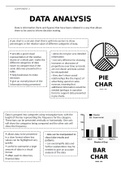
COMPONENT 2
DATA ANALYSIS
Data is information (facts and figures) that have been collated in a way that allows
them to be used to inform decision making.
A pie chart is a circular chart that is split into sectors to show
percentages or the relative value of different categories of data.
+ provide a good visual - alone do not give very detailed
representation of the relative information
shares of a whole part -make the - not very effective for showing
different categories of data increases or decreases of
easier to compare than if the proportions over time as trends
same data was presented in a are not shown and data cannot
table. be extrapolated
+ help businesses to make - they don’t show causal
decisions
+ give an overall picture of the
relationships like the impact of
advertising spend on sales
PIE
information being presented revenue, meaning that
additional information would be
CHAR
needed (perhaps in narrative
form) to support data presented TS
in pie charts.
Data is grouped into categories using rectangular bars, with the
height of the bar representing the frequency for the category.
These bars can be presented vertically or horizontally. One axis
will show the categories being compared and the other axis will
show the frequency.
+ allows data to be presented - data can be manipulated to
in a clear format where key show false results and
values can be highlighted very patterns.
quickly - can oversimplify data and
+ useful to summarise a large further explanations may be
amount of data in a visual
format
needed to give an accurate
analysis of the data
BAR
+ often used to show key
financial data CHAR
TS
, COMPONENT 2
Histograms show quantitative data, and the data in a histogram is
continuous so there are no gaps between the bars which represent
the different intervals. The area of each bar is proportional to the
frequency for each interval. Both the x-axis and y-axis have a scale.
+ helps depict large - cannot be used for exact
differences in shape or values as the data is grouped
symmetry of the data into intervals
collected - the effectiveness of data
+ useful when displaying data decreases when the range of
which has chronological
categories or numerical
data is too wide – if groups are
large then the data could be HISTOGR
AMS
groupings less meaningful
+ shows the shape of the
distribution for a large set of
data
Line graphs are used to compare two variables. The x-axis
represents a continuous variable (e.g. time) and the y-axis
represents the second variable (e.g. quantity or value). A line graph
is plotted as a series of points and then joined to produce a
continuous line. The line graph shows the relationship between the
two variables.
+ show business performance - a wide range of data is
and used to analyse market challenging to plot
trends - Plotting too many lines
+ clearly show error values in over the graph makes it
the data cluttered and confusing to
+ More than one line may be read
plotted on the same axis as a - only ideal for
form of comparison representing data that have
numerical values
LINE
GRAPH
S
, COMPONENT 2
An index number is an economic data figure reflecting price
or quantity compared with a base value. They show
percentage changes compared with a base number.
+ they’re a useful method of - They may be useful for
showing changes over time one purpose but not for
in data another
+ allows data to be
standardised over time so
- They are simply rough
indications of the relative
INDEX
that the data is easily
comparable
changes
NUMBE
+ help to interpret, analyse
and compare large numbers RS
The benefits of buying summaries with Stuvia:
Guaranteed quality through customer reviews
Stuvia customers have reviewed more than 700,000 summaries. This how you know that you are buying the best documents.
Quick and easy check-out
You can quickly pay through EFT, credit card or Stuvia-credit for the summaries. There is no membership needed.
Focus on what matters
Your fellow students write the study notes themselves, which is why the documents are always reliable and up-to-date. This ensures you quickly get to the core!
Frequently asked questions
What do I get when I buy this document?
You get a PDF, available immediately after your purchase. The purchased document is accessible anytime, anywhere and indefinitely through your profile.
Satisfaction guarantee: how does it work?
Our satisfaction guarantee ensures that you always find a study document that suits you well. You fill out a form, and our customer service team takes care of the rest.
Who am I buying this summary from?
Stuvia is a marketplace, so you are not buying this document from us, but from seller 3ellaclark. Stuvia facilitates payment to the seller.
Will I be stuck with a subscription?
No, you only buy this summary for R250,24. You're not tied to anything after your purchase.