TV – Deutschland 83
Context
Martin Rauch, a 24-year old East Germany native, who is who is thrust
from the world as he knows and sent over the wall to the West as an
undercover spy for the Stasi
Hiding in plain sight in the West German army, he must gather the
secrets of NATO military strategy while trying to resist the pleasures
that the West has to offer
Stylish, fast-paced and utterly gripping, the series, created by German-
American husband and wife, Anna Winger and Joerg Winger, reveals
the experiences of Germans from both sides of the Berlin Wall during
a pivotal period of Cold War tensions where the world’s nuclear
arsenals rested on a hair trigger
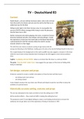
The UK DVD cover shows an almost coming of age drama with the
young man listening to the Walkman, looking up to the sky as he may be finding himself of who he is
The couple kissing in the background on the wall in graffiti may also suggest a romance in the show
while the much more serious bearded men frowning on the left suggest a more serious political
story
Tagline: 'A gripping cold war thriller' allows us to know that the show is a cold war thriller
The print: ‘Over the Wall- Under Cover’ may suggest the spy aspect of the show of hiding while
being in espionage
Set design, costume and props
Producers wanted to create a realistic atmosphere of how the East and West were:
- one being much more serious
- one being relaxed
It also helped construct the way shots were filmed and helped create the real effect to keep the
aesthetic of a period drama
Historically accurate setting, costume and props
The set was attempted to be made as similar to how the setting was in 1989
All the practical effects – they could not fulfil in making the setting feel real
The producers used CGI and digital editing to create a real looking environment to ensure the
audiences do not get taken out of the experience of being in Germany in 1983
, American branding use font, colour and graphics to appeal to an audience
The font is much more modern than the UK one with little connotation to war with the slightly
distorted text while the UK one featured text straight from the 80's war/commercial font
this may be to attract the younger audience it seems to be trying to get with the first
episode being available on iTunes
The colouring of the poster pops out to a modern and young audience with bright appealing colours
The graphics of the missiles and the Berlin war suggest the Cold War directly, but they also offer
action audience pleasure as some audiences are attracted to signs of violence
The text of the airing on Sundance may show that the audience it is still trying to mainly attract is a
highly educated one as Sundance content is typically made to be deconstructed an analysed, the
young appeal may be to try to grab a few extra viewers
Context
Martin Rauch, a 24-year old East Germany native, who is who is thrust
from the world as he knows and sent over the wall to the West as an
undercover spy for the Stasi
Hiding in plain sight in the West German army, he must gather the
secrets of NATO military strategy while trying to resist the pleasures
that the West has to offer
Stylish, fast-paced and utterly gripping, the series, created by German-
American husband and wife, Anna Winger and Joerg Winger, reveals
the experiences of Germans from both sides of the Berlin Wall during
a pivotal period of Cold War tensions where the world’s nuclear
arsenals rested on a hair trigger
The UK DVD cover shows an almost coming of age drama with the
young man listening to the Walkman, looking up to the sky as he may be finding himself of who he is
The couple kissing in the background on the wall in graffiti may also suggest a romance in the show
while the much more serious bearded men frowning on the left suggest a more serious political
story
Tagline: 'A gripping cold war thriller' allows us to know that the show is a cold war thriller
The print: ‘Over the Wall- Under Cover’ may suggest the spy aspect of the show of hiding while
being in espionage
Set design, costume and props
Producers wanted to create a realistic atmosphere of how the East and West were:
- one being much more serious
- one being relaxed
It also helped construct the way shots were filmed and helped create the real effect to keep the
aesthetic of a period drama
Historically accurate setting, costume and props
The set was attempted to be made as similar to how the setting was in 1989
All the practical effects – they could not fulfil in making the setting feel real
The producers used CGI and digital editing to create a real looking environment to ensure the
audiences do not get taken out of the experience of being in Germany in 1983
, American branding use font, colour and graphics to appeal to an audience
The font is much more modern than the UK one with little connotation to war with the slightly
distorted text while the UK one featured text straight from the 80's war/commercial font
this may be to attract the younger audience it seems to be trying to get with the first
episode being available on iTunes
The colouring of the poster pops out to a modern and young audience with bright appealing colours
The graphics of the missiles and the Berlin war suggest the Cold War directly, but they also offer
action audience pleasure as some audiences are attracted to signs of violence
The text of the airing on Sundance may show that the audience it is still trying to mainly attract is a
highly educated one as Sundance content is typically made to be deconstructed an analysed, the
young appeal may be to try to grab a few extra viewers