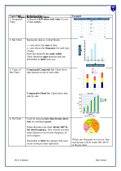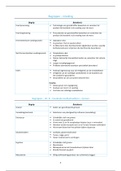
Topic/Skill Definition/Tips Data
Topic: Representing Example
1. Frequency A record of how often each value in a set
Table of data occurs.
2. Bar Chart Represents data as vertical blocks.
x−axis shows the type of data
y−axis shows the frequency for each type
of data
Each bar should be the same width
There should be gaps between each bar
Remember to label each axis.
3. Types of Compound/Composite Bar Charts show
Bar Chart data stacked on top of each other.
Comparative/Dual Bar Charts show data
side by side.
4. Pie Chart Used for showing how data breaks down
into its constituent parts.
When drawing a pie chart, divide 360° by
the total frequency. This will tell you how
many degrees to use for the frequency of
each category.
If there are 40 people in a survey, then
Remember to label the category that each
each person will be worth 360÷40=9°
sector in the pie chart represents.
of the pie chart.
Mr A. Coleman Glyn School