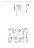
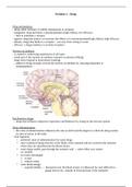
Design Principles
Eight Golden Rules of Interface Design (repeated)
1. Strive for consistency
2. Enable frequent users to use shortcuts
3. Offer informative feedback
4. Design dialogues to yield closure
5. Strive to prevent errors
6. Help users recover quickly
7. Allow Undo
8. Make users feel they are in control of a responsive system
The 10 Usability Heuristics
Design Principles:
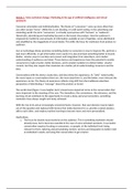
Design Principles 1 Design Principles 2
, 1. Recognition over recall 6. Aesthetic Usability Effect
ie, give input format (ie, criteria when making a password). breadcrumbs to note Things that look better perform better in usability tests!
where we are.
The attractive product will be perceived as easier to use.
by improving the attractiveness it increases the perceived ease of use –
improving the chances of making a sale Users will be more likely to develop
2. Knowledge and chunking
positive feelings towards the attractive product.
To improve on memory we tend to chunk actions (group actions into a lump).
This can lead to:
To help, we need to differentiate “knowledge in head” and “knowledge in world”
(Display-based action (e.g. response to touch), Recognition vs. Recall) Positive reviews – leading to more sales
They’ll tell their friends – resulting in more sales leads
They’ll tolerate faults more – reducing support calls
3. 80/20 Pareto Law (NB)
The attractive product will be perceived as of higher quality
20% of the functionality will be used 80% of the time. Focus on this 20%, make it
good and easy to do, and then only focus on additional. Most Importantly: customers may overlook feature deficiencies so they get to
use the more attractive product
4. Principle of Least Effort (NB)
Make frequent things easy, and unlikely things harder 7. Apparent Usability vs Inherent Usability
→ Similar to the simplicity idea, this manifests in the following ways: The user may be strongly affected by the aesthetic aspect of the interface even
when they try to evaluate the interface in its functional aspects
Morse code’s “E” is only one dot; apostrophe is 6 dots and dashes
and it is suggested that the interface designers should strive not only to
Menus are organized with common things at top improve the inherent usability but also brush up the apparent usability or
“Dangerous” operations can be heavily nested or require many clicks and the aesthetic aspect of the interface.
presses
8. Modes
5. Principle of Least Astonishment → Modes allow different behaviors from the same interface features (e.g. Caps Lock,
Reflect inner workings or user intuition? Num Lock)
→ Not necessarily bad – but sometimes really bad!
Consistency is a key goal in user interface design
If mode change is not obvious – device appears non-deterministic (e.g. case-
Applies to both functionality and form
sensitive passwords)
People are part of the system. The design should match the user's experience,
→ Polya’s principle of “Non-sufficient reason”:
expectations, and mental models.
If there’s no reason to believe things are different, they aren’t different
Design Principles 3 Design Principles 4
Eight Golden Rules of Interface Design (repeated)
1. Strive for consistency
2. Enable frequent users to use shortcuts
3. Offer informative feedback
4. Design dialogues to yield closure
5. Strive to prevent errors
6. Help users recover quickly
7. Allow Undo
8. Make users feel they are in control of a responsive system
The 10 Usability Heuristics
Design Principles:
Design Principles 1 Design Principles 2
, 1. Recognition over recall 6. Aesthetic Usability Effect
ie, give input format (ie, criteria when making a password). breadcrumbs to note Things that look better perform better in usability tests!
where we are.
The attractive product will be perceived as easier to use.
by improving the attractiveness it increases the perceived ease of use –
improving the chances of making a sale Users will be more likely to develop
2. Knowledge and chunking
positive feelings towards the attractive product.
To improve on memory we tend to chunk actions (group actions into a lump).
This can lead to:
To help, we need to differentiate “knowledge in head” and “knowledge in world”
(Display-based action (e.g. response to touch), Recognition vs. Recall) Positive reviews – leading to more sales
They’ll tell their friends – resulting in more sales leads
They’ll tolerate faults more – reducing support calls
3. 80/20 Pareto Law (NB)
The attractive product will be perceived as of higher quality
20% of the functionality will be used 80% of the time. Focus on this 20%, make it
good and easy to do, and then only focus on additional. Most Importantly: customers may overlook feature deficiencies so they get to
use the more attractive product
4. Principle of Least Effort (NB)
Make frequent things easy, and unlikely things harder 7. Apparent Usability vs Inherent Usability
→ Similar to the simplicity idea, this manifests in the following ways: The user may be strongly affected by the aesthetic aspect of the interface even
when they try to evaluate the interface in its functional aspects
Morse code’s “E” is only one dot; apostrophe is 6 dots and dashes
and it is suggested that the interface designers should strive not only to
Menus are organized with common things at top improve the inherent usability but also brush up the apparent usability or
“Dangerous” operations can be heavily nested or require many clicks and the aesthetic aspect of the interface.
presses
8. Modes
5. Principle of Least Astonishment → Modes allow different behaviors from the same interface features (e.g. Caps Lock,
Reflect inner workings or user intuition? Num Lock)
→ Not necessarily bad – but sometimes really bad!
Consistency is a key goal in user interface design
If mode change is not obvious – device appears non-deterministic (e.g. case-
Applies to both functionality and form
sensitive passwords)
People are part of the system. The design should match the user's experience,
→ Polya’s principle of “Non-sufficient reason”:
expectations, and mental models.
If there’s no reason to believe things are different, they aren’t different
Design Principles 3 Design Principles 4